1 Introduction
[hide]
PI LaunchPad gives PixInsight launchpads: toolbars, up to ten of them on screen at once, whose buttons each hold a complete process instance, a link to a file (images, an .xpsm file, etc), or a script. A single click launches a button exactly as double-clicking a process icon on the workspace does.
The point is not that PixInsight lacks a way to keep process icons around: it has one, and the workspace holds them perfectly well. The point is that a workspace full of icons is a pile, and a launchpad is a tool.
PI LaunchPad stores the process instance's own serialized definition, so once an item is added, the original process icon can be deleted and the button still works. We, the user, name the Items, arrange them, group by them, and they survive across sessions.
PI LaunchPad comes with 28 different launchpad themes, but if we want to design our own, the launchpads are ours to style. Every color, size, spacing, font, texture, image and effect belongs to a theme, and themes are files we can save, load and share. A launchpad can be a discreet vertical strip that looks like the rest of PixInsight, or a wide grid of labelled buttons over a Hubble frame; both are the same module with a different theme loaded. Each launchpad has a theme of its own, so both can be on screen together.
PI LaunchPad in use:
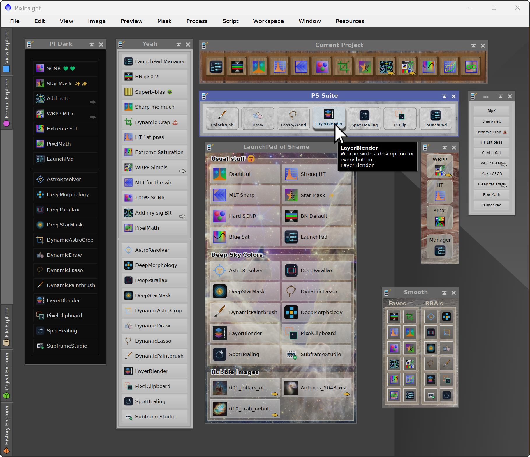
Eight launchpads, each with its own theme, on a PixInsight workspace.
2 Setup and Installation
[hide]
The only official distribution of PI LaunchPad is via a PixInsight repository, which will fetch the module directly and safely from our PixInsight repository at:
https://repo.deepskycolors.com/PILaunchPad/
Make sure the trailing / is part of the URL. Also, be sure to keep our repository URL in your list of PixInsight repositories to receive timely updates.
By distributing PI LaunchPad only via our PixInsight repository, installation comes with the guarantee of our Developer and Repository certificates, verified by PixInsight itself from the moment it connects to our repository, until it validates and completes installation of the module.
2.1 Launching PI LaunchPad normally
The first time we launch PI LaunchPad, or if we never complete the startup step detailed below in 2.2, we need to run PI LaunchPad manually, like every other normal process.
In Process Explorer or via the PROCESS menu, PI LaunchPad is listed under the DeepSkyColors and Global categories as PILaunchPad. Opening it shows the Main LaunchPad, and with it every other launchpad that is not hidden.
The module has three kinds of window:
- The launchpads: one window each, titled with the launchpad's name. The Main LaunchPad is the process's default interface.
- PI LaunchPad Manager: where the launchpads' contents are administered, one launchpad at a time.
- Theme Editor: where a launchpad is styled.
The launchpads deliberately have no control bar: no drag triangle, no Apply, no Reset. That is what makes them read as tool strips rather than as process dialogs. The consequence is that the control bar lives on the Manager window: the drag triangle a LaunchPad process icon is generated from, the button that opens this documentation, and the wrench that opens the license dialog.
Every launchpad has a manager button. It cannot be removed: without it there would be no way back into the Manager once a launchpad is the only window left open. It can be renamed, given a custom icon, and moved anywhere in the order like any other item.
The three kinds of window:
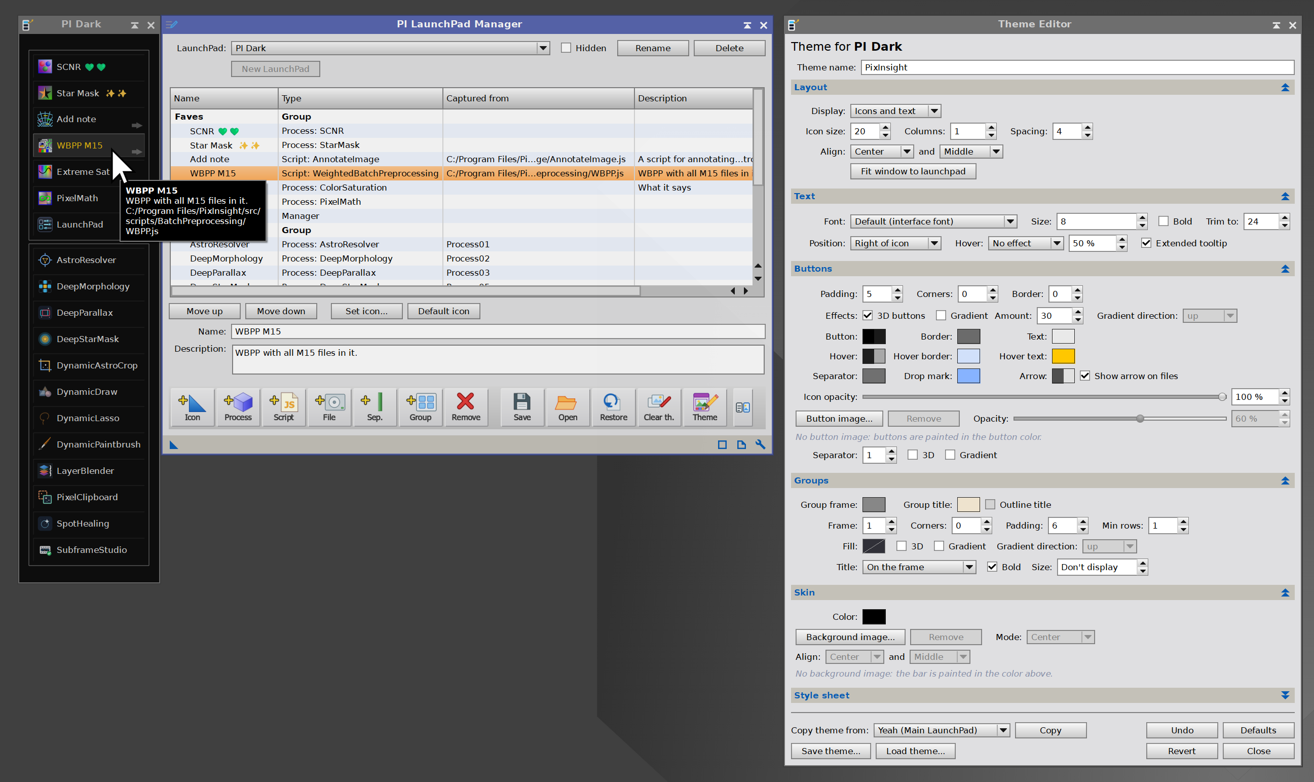
A launchpad, the PI LaunchPad Manager and the Theme Editor.
2.2 Opening the launchpads automatically at startup
PixInsight can open the launchpads by itself every time it starts: the Main LaunchPad, and every other one that is not hidden. For that, PixInsight has to be started with PI LaunchPad's startup script, PILaunchPadStartup.js, which is installed in the src/scripts/PILaunchPad folder of the PixInsight installation.
The steps below create a launcher that does this. From then on we start PixInsight from that launcher instead of from its usual icon. The paths shown are PixInsight's default installation folders; if PixInsight is installed elsewhere, both paths change to match.
Windows
- Right-click the desktop and choose New > Shortcut.
- As the location of the item, enter:
"C:\Program Files\PixInsight\bin\PixInsight.exe" -r="C:\Program Files\PixInsight\src\scripts\PILaunchPad\PILaunchPadStartup.js" - Name it PixInsight with LaunchPad and click Finish.
- Right-click the new shortcut, choose Show more options, then Pin to taskbar. If that entry is not there, copy the shortcut into
%AppData%\Microsoft\Windows\Start Menu\Programs, find it in the Start menu, right-click it and pin it from there.
macOS
- Open Automator, choose New Document, then Application.
- Add the Run Shell Script action, and replace its contents with:
open -a /Applications/PixInsight/PixInsight.app --args -r=/Applications/PixInsight/PixInsight.app/Contents/src/scripts/PILaunchPad/PILaunchPadStartup.js - Save it in Applications as PixInsight with LaunchPad.
- Drag it from Applications to the Dock.
Linux
- Create a text file named
pixinsight-launchpad.desktopin~/.local/share/applications, containing:[Desktop Entry] Type=Application Name=PixInsight with LaunchPad Exec=/opt/PixInsight/bin/PixInsight -r=/opt/PixInsight/src/scripts/PILaunchPad/PILaunchPadStartup.js Terminal=false
- Find PixInsight with LaunchPad in the applications menu, and add it to the dock or panel from there.
2.3 Licensing
PI LaunchPad is licensed software with a 30-day trial. The wrench on the Manager window's control bar opens the license dialog, which reports the current status and is where an email address and a license key are entered.
When the trial ends, PI LaunchPad does not stop working. It continues as a free tier that launches the first five buttons of the Main LaunchPad. A notice says so once, the first time the module runs after the trial is over.
Nothing is ever deleted. A launchpad of twenty buttons stays a launchpad of twenty buttons: every item keeps its name, its icon, its custom settings and its stored definition, and the configuration file on disk keeps all of them. Buttons past the fifth are drawn greyed out and do not launch, and the Manager lists them all, marked needs a license, so we can see the work is intact. Registering brings every one of them back at once, with no import step and no restart.
The free tier is also one launchpad. Additional launchpads keep their buttons, their themes and their files, and stay editable in the Manager, but they do not open. Registering brings them back exactly as they were left.
The limit counts only what a button launches: process items, file items and scripts. Separators, group headings and the manager button are exempt, so a five-button launchpad can still be organized freely. Themes are not limited in any way, and neither are configurations, the Theme Editor, or the themes that ship with the module.
Which five are live is simply the first five in the Main LaunchPad's order, so reordering its list chooses them. See 5.4.
The free tier:
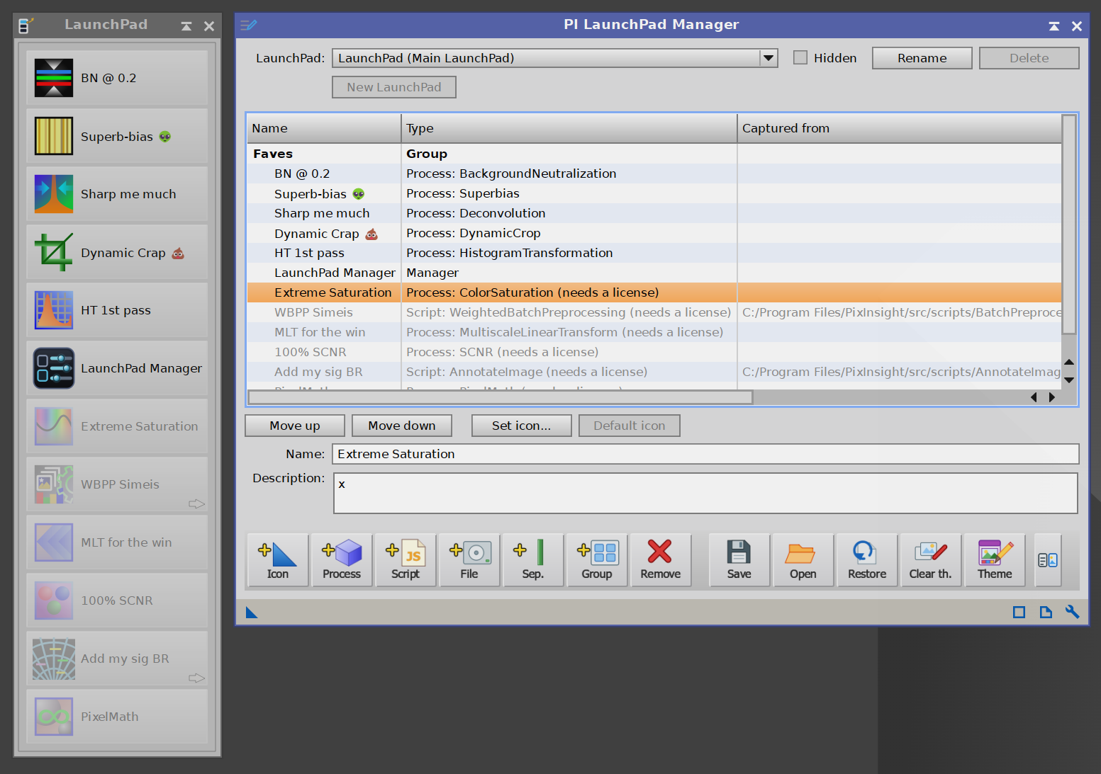
After the trial, buttons past the fifth are greyed out on the launchpad and marked needs a license in the Manager. Nothing is removed.
3 The launchpad windows
[hide]
Each launchpad is a window of its own, titled with the launchpad's name. Inside it is a single custom-drawn surface rather than a row of ordinary buttons, which is what allows it to be themed as completely as it is.
Clicking
A single click launches an item. Activation happens on release over the same button the press started on, so a click that drifts off a button does nothing, and a press that turns into a drag reorders instead of launching.
Reordering by dragging
Dragging a button moves it. A press becomes a drag after about five pixels of travel, and an insertion marker shows where the button will land. A drag can also move a button from one group to another: where it lands is decided by the group the cursor is over, so dropping it inside another group's frame moves it there, dropping it clear of every frame leaves it outside the groups, and an empty group accepts a button as readily as any other.
Tool tips
Hovering a button shows its name after a short delay. When Extended tooltip is on, the tool tip also shows the button's description and then, for scripts and other files, the original path to the file; for a process, the process it launches.
Resizing
A launchpad window is resizable, and the bar fills it completely, which is why a background image covers the whole window rather than stopping at the buttons. Where the buttons sit in a window larger than they need is set by the theme's alignment. Fit window to launchpad, in the Theme Editor, shrinks the window back to exactly what the buttons need, spacing margin included.
The window resizes itself automatically whenever a change makes its old size meaningless: loading a theme, restoring defaults, reverting, or changing Display, Icon size, Columns or text Position. Other adjustments leave a window we have sized ourselves alone, so that editing a theme live does not fight us.
An extended tool tip:
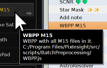
Hovering a button shows its name and, with Extended tooltip on, its description and what it launches.
4 What a launchpad can hold
[hide]
4.1 Process items
A process item holds a complete process instance: the process and every parameter it was saved with. Clicking it opens that process with those parameters, which is what double-clicking a process icon does.
Items are captured from process icons on the workspace, through Add from workspace... in the Manager. What is stored is the instance's own serialized definition, so the workspace icon it came from can then be renamed or deleted without affecting the button.
A captured button is named after the icon, not its process: the icon id is what we called that particular instance, and it is what the Manager's third column shows. The name is editable; the column is not. Naming buttons after the process instead would call every captured PixelMath icon "PixelMath".
Process icon files. A .xpsm file holds one process icon or a whole collection of them. Adding one through Add file... captures the icons it names, as process items, rather than making a button that opens the file. A file holding twenty icons therefore becomes twenty buttons in one step, which is worth doing even for icons already on the workspace, since Add from workspace... takes one at a time.
The icons do not have to be open in PixInsight. An icon the workspace already has is captured from it directly; any other is rebuilt from the file's own description of the instance, and the result is then serialized by PixInsight itself, so what a button stores is the same text a hand-captured one stores.
That conversion refuses rather than guesses. Every setting it restores is read back and compared, and an icon whose settings do not survive the round trip is reported by name and left out instead of being added with something approximate. A process the file needs but this installation does not have is reported the same way, and so is a Script icon whose script is not installed: the script is part of what that icon is, and a button that cannot run is worse than no button. Whatever could not be added is listed in the console with its reason.
Each stored definition carries a cryptographic signature, verified both when the launchpad is loaded and again when a button is clicked. An item whose definition does not match its signature is refused rather than launched. The configuration file is plain text in a user-writable folder, and a stored definition is executable script, so this is not a formality.
Icons come from PixInsight itself wherever it ships one for the process. Processes with no installed icon get PixInsight's generic blue cube, and Deep Sky Colors processes carry their own icons inside the module.
Add from workspace:
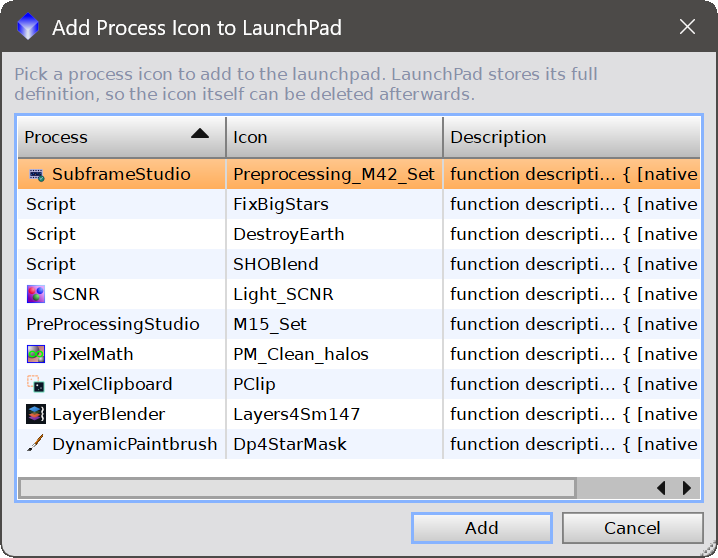
The process icons on the workspace, ready to be captured as buttons.
4.2 File items
A file item holds a path. Clicking it opens that file in PixInsight.
Nothing about the file is checked when it is added: the path is stored as given, so a link to a file on a drive that is not currently mounted survives rather than being refused.
When the file is an image PixInsight can read, a thumbnail of it becomes the button's icon. The thumbnail is generated once, when the item is added, and stored inside the launchpad, so it is never regenerated afterwards. It is autostretched with PixInsight's own screen transfer function: astronomical data is linear, and a direct rendition of a light frame would be a black square.
Clear thumbnails in the Manager drops generated thumbnails so they are made again next time. An icon we chose ourselves is left alone: that is a decision, not a cache.
4.3 Script items
A file item whose path ends in .js is a script: clicking it runs the script rather than trying to open it as an image.
PixInsight scripts describe themselves, and LaunchPad reads that description rather than making us retype it. When a script is added:
#feature-idgives the button its name.#feature-icongives it its icon, including the@script_icons_dirform that PixInsight's own scripts use.#feature-infogives it the description shown in its tool tip. Only the first line is taken, with its markup removed; a line that continues onto the next ends in an ellipsis.
Add script... in the Manager lists every script installed with PixInsight that declares a feature id, which is the same test PixInsight uses to decide what belongs in the SCRIPT menu. The list can be sorted by script name, category or description, and several scripts can be added at once.
Add script:
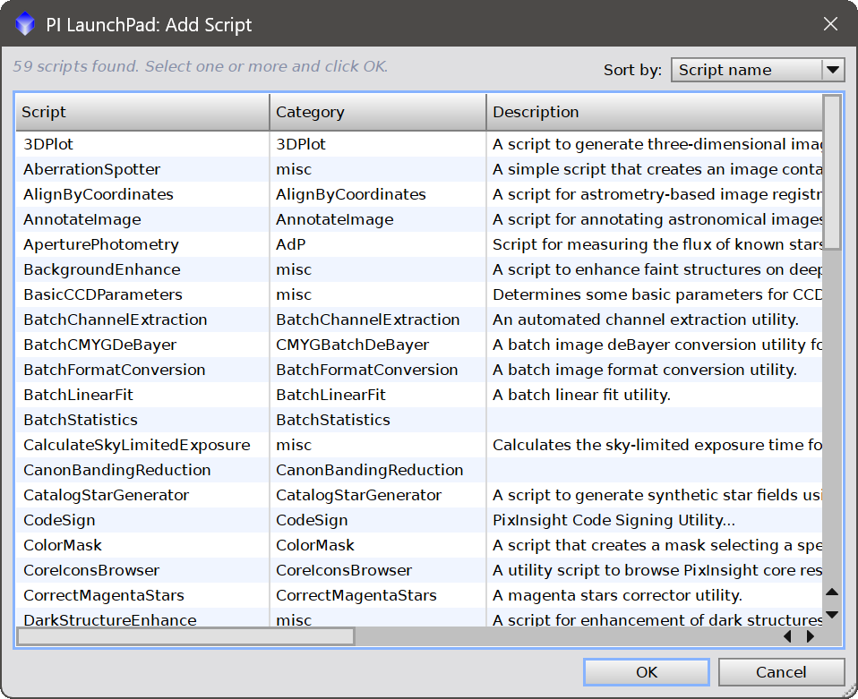
Every script installed with PixInsight that declares a feature id, sortable by name, category or description.
4.4 Separators
A separator is a divider between buttons. It occupies a place in the order, is never a hit target, and cannot be clicked or launched.
Its orientation follows the layout rather than the display mode: buttons stacked vertically are divided by a horizontal line, buttons side by side by a vertical one. Its color, thickness and effects are set in the Theme Editor.
4.5 Groups
A group is a titled band of buttons, drawn with its own frame and fill.
Groups are headings in the item list. Everything after a heading belongs to it, until the next heading or the end of the list. Two things follow from that, and both are worth knowing:
- Items before the first heading are the ungrouped ones. There is no such thing as an "ungrouped group" to create or manage: it is simply the run of items above the first group.
- A new group is always added at the end, and it has to be. A heading owns everything after it, so inserting one in the middle would take the following buttons away from the group that currently has them.
Each group starts a new row, which is what allows its frame to be a rectangle. Groups can be moved as a whole with Move up and Move down, which swaps a group with the whole group next to it. The ungrouped run is not a group and always stays first, so the topmost group cannot be moved above it.
Groups are laid out like buttons: a group is only as wide as its contents need, and groups pack across the bar and wrap to a new line when the next one does not fit. Raising the column count therefore puts groups side by side rather than leaving empty space to the right of each one. Buttons line up across framed and unframed groups alike.
Whether a group draws its title and its frame belongs to the theme, and applies to every group at once: Groups > Font size set to Don't display hides the titles, and Groups > Frame set to zero hides the frames. Both are in the Theme Editor, described below.
Groups:
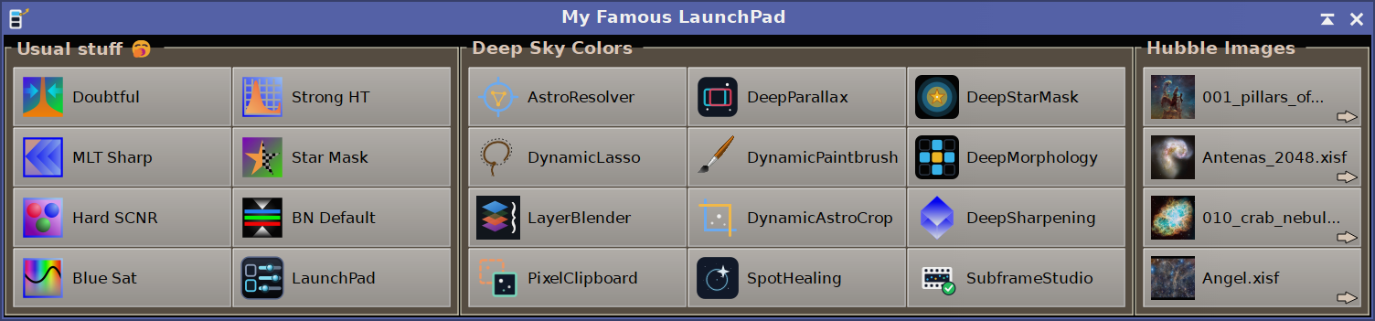
Buttons organized in titled, framed groups.
5 The Manager window
[hide]
The Manager is where the launchpads' contents are administered, one launchpad at a time: the one selected in its top row, described next. It is opened from the manager button on any launchpad, and opens on that launchpad, as does the Theme Editor if it is open. It is a normal window: every launchpad stays usable while it is open.
The PI LaunchPad Manager:
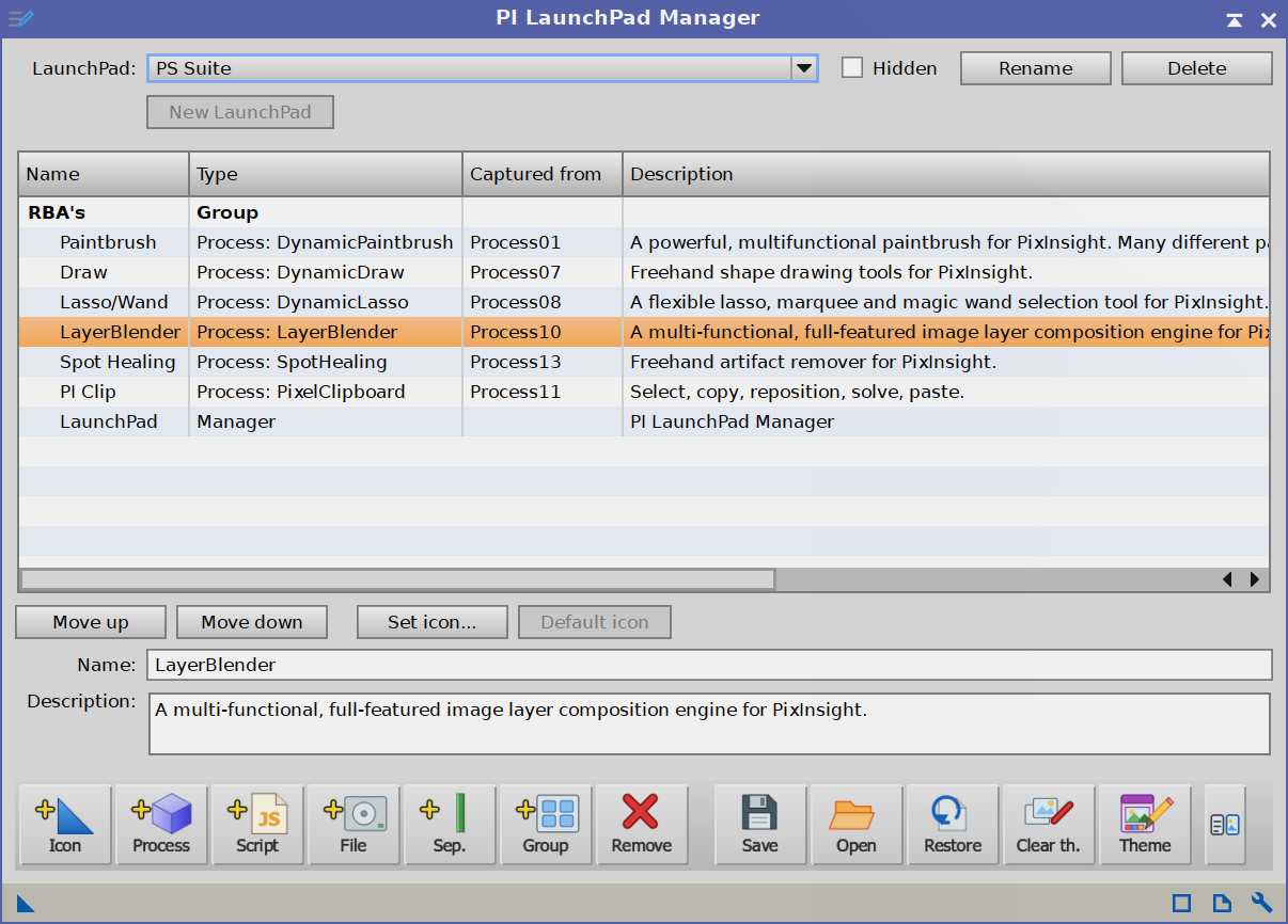
The launchpad row at the top, the item list, and the controls that act on the selected launchpad.
5.1 Several launchpads
There can be more than one launchpad. Each is a window of its own with its own buttons and its own theme, so a calibration strip and a stretching strip can sit side by side looking nothing like each other.
The row at the top of the Manager selects which one we are editing. Everything below that row applies to the launchpad named there: the item list, the ordering, the icons, and the theme the Theme Editor shows. The Theme Editor says which one it is pointed at in its first line, so a theme cannot be applied to the wrong launchpad by accident.
- LaunchPad: which launchpad is being edited. Selecting one brings its window forward.
- Hidden: takes this launchpad off the screen and keeps it closed when PixInsight starts. It still exists and is still edited here. The Main LaunchPad cannot be hidden: it is PI LaunchPad's main window, the one PixInsight opens whenever PI LaunchPad is opened.
- Rename: gives this launchpad a different name. Only the name changes: its buttons, its theme and whether it is hidden are untouched. The Main LaunchPad can be renamed as well: it remains the Main LaunchPad, first in the list and never hidden, and is listed as the name we give it (Main LaunchPad).
- Delete: removes this launchpad and its file. The Main LaunchPad cannot be deleted.
- New LaunchPad: creates another one, starting as a copy of the launchpad currently selected, with the same buttons and the same theme, and switches to it. Only its name is asked for.
A new launchpad starting as a copy is deliberate: it opens looking like something rather than like nothing, and deleting the buttons that do not belong is quicker than adding the ones that do.
The first launchpad is the Main LaunchPad. It always exists, because it is what everything falls back to, and it is the window PixInsight opens when the PILaunchPad process is opened from the PROCESS menu or Process Explorer.
We can give it a name of our own. It stays the Main LaunchPad in every other respect, and wherever launchpads are listed it reads our name (Main LaunchPad), so the one that always exists stays recognizable in the list.
There can be up to ten launchpads. PixInsight registers a module's interface windows when the module is installed and cannot create one afterwards, so the windows are reserved in advance and handed out as launchpads are created. New LaunchPad is disabled once all ten are in use; deleting one frees it again.
When PixInsight starts, every launchpad that is not hidden opens.
The LaunchPad row:

Choosing, hiding, renaming, deleting and creating launchpads.
5.2 The item list
The list shows every item of the selected launchpad in launchpad order. Group headings are shown in bold, with the items of a group indented under them. Four columns:
- Name: what the button is called. This is the label in the two text display modes, and the tool tip in icons-only mode.
- Type: what the button really is: Process: followed by the process id, Script: followed by the script's name, Image, File, Separator, Group or Manager. The process id and the script name survive a rename, and this is the only place either is visible. On the free tier, a button past the limit is marked needs a license.
- Captured from: the workspace process icon an item was captured from, or a file item's path. This is provenance only: it is not used to launch anything, and it is empty for items that were not captured from an icon.
- Description: the one line the Description box below the list holds for the selected item, which is also what the button's tool tip shows. A long description is not cut short: the list scrolls sideways rather than the window growing to fit it.
The list is deliberately not sortable. The row order is the launchpad order, and a sorted view would misrepresent it.
Name: the field below the list renames the selected item. Press Enter to apply. Empty names are refused: an unnamed item is unidentifiable in the text modes and has no tool tip in the third.
Description: a line about what the button does, shown under its name in the tool tip when Extended tooltip is on. For a script it starts as the script's own #feature-info. It is free text and purely descriptive: nothing written here changes what the button launches.
5.3 Adding and removing
Each of these is a button in the Manager. In icon mode the same actions carry the icons shown here, in this order.
 | Add from workspace... | lists the process icons currently on the workspace, and captures the chosen ones. |
 | Add process... | lists the processes installed in PixInsight and adds the chosen ones. The button opens its process with the process's own default parameters, the way Process Explorer does, so nothing is captured and nothing is stored: to keep a process with settings already in it, use Add from workspace... instead. The list can be filtered by name or category and sorted by either, and several processes can be added at once. Processes with no interface are not listed, because a launchpad button opens a process and those have nothing to open. |
 | Add file... | adds a button that opens a file. Not restricted to images: what PixInsight can open is the core's business, not this module's to second-guess. A .xpsm is treated as what it is, a process icon file, and is described below. |
 | Add script... | browses the scripts installed with PixInsight. See 4.3. |
 | Add separator | adds a divider. |
 | Add group | adds a group heading at the end, selects it, and puts the cursor in the Name field, since naming it is the next thing anyone does. |
 | Remove | removes the selected item. The manager button is refused. |
| text buttons only | Set icon... | gives the selected item a custom icon from an image file. SVG is best, because the launchpad's icon size is adjustable and SVG rescales cleanly, but any image PixInsight can read works. The icon is stored inside the launchpad, so it travels with saved configurations and exported process icons rather than pointing at a file that might move. |
| text buttons only | Default icon | drops the custom icon, so the item falls back to the default for its type. |
 | Clear thumbnails | drops generated file thumbnails. Icons we chose ourselves are untouched. |
New buttons are added at the end of the ungrouped run, just before the manager button. With no groups defined that is simply the end of the launchpad; once groups exist it keeps a new button out of a group we never put it in.
5.4 Ordering
Move up and Move down move the selected item one row, exactly as though the list were flat. Moving an item past a group heading is therefore how it enters that group, and moving it off the end of a group's run is how it leaves: this is the way to move a button from one group to another.
When the selected item is a group heading, the whole group travels with it, and it swaps with the entire group next to it rather than with a single row.
Dragging buttons on the launchpad itself does the same job, and moves an item between groups as well: the group the cursor is over is the one it joins.
5.5 Configurations
A configuration is a whole launchpad: its items and its complete theme, in one file.
- Save configuration...: writes the selected launchpad to a
.pilpfile. A theme on its own is a.pilpthemefile. LaunchPads saved by earlier builds used.txt; those still load, and the Load dialog keeps a filter for them. - Load configuration...: replaces the selected launchpad's buttons and theme with the ones in a file. Its name and whether it is hidden stay as they were.
- Restore...: puts the selected launchpad back the way it was at a restore point, described below. Enabled only when there is one.
Loading is destructive by design: loading a saved configuration means switching to it. It is not a one-way door, though. The launchpad being replaced is kept first as a restore point, and the console says so; if the restore point cannot be written, the launchpad is not replaced.
A LaunchPad process icon replaces launchpads too, when it is double-clicked or dropped on the Manager. A process icon carrying no launchpad, such as one just created from Process Explorer, is treated as a request to open the Main LaunchPad and changes nothing.
An icon carries every launchpad, and each one goes back to its own slot, with its name, its theme and its hidden state, wherever we drop the icon and whichever launchpad the Manager is pointed at. Those that are not hidden open. Importing an icon on a second machine therefore reproduces the whole set we exported from the first.
A launchpad that already matches the icon is left alone, so opening the same icon twice changes nothing. A launchpad the icon replaces is first kept as a restore point, and the console names it; if the restore point cannot be written, the launchpad is not replaced. Nothing is restored from a launchpad the icon could not read when it was generated.
Restore points
A restore point is a launchpad as it was at a moment worth coming back to. One is kept:
- whenever a configuration is loaded, a process icon replaces a launchpad, or a restore is made;
- in the Theme Editor, whenever a theme is loaded, the theme is reset to defaults, or Undo is used;
- at the first change of a Theme Editor session, holding the look the launchpad had when the session began;
- when the Theme Editor is closed, if anything changed since the last restore point.
Opening and closing the Theme Editor without changing anything keeps nothing. Each launchpad keeps its ten most recent restore points. The launchpad's previous generation is offered too: every change keeps the one before it, so the most recent change can always be undone.
Restore... lists the selected launchpad's restore points, newest first. Each shows the date and time it was kept and what replaced the launchpad at that moment, such as 2026/09/11, 22:12:04 : Before a theme was loaded. A point kept under a different name, which happens when a deleted launchpad's place is reused, shows that name in parentheses at the end.
Restoring replaces the launchpad's buttons and theme; its name, and whether it is hidden, stay as they are. The launchpad as it was before the restore is kept as a restore point of its own, so a restore can itself be undone.
Theme Editor... opens the Theme Editor, described next.
The Restore dialog:
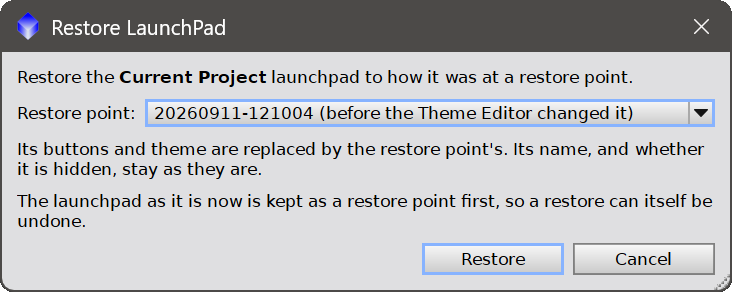
The restore points kept for the selected launchpad, each labelled with when and why it was kept.
5.6 Text buttons or an icon toolbar
The Manager's actions come in two forms, and the small button at the right of the row chooses between them. The first is the rows of text buttons described above. The second is a single row of icons, one action per button, in this order: Icon, Process, Script, File, Sep. and Group, then Remove, and after a gap Save, Open, Restore, Clear th. and Theme.
The two are the same actions, and a button on one does exactly what its counterpart on the other does. The gap separates what acts on a single item from what acts on the whole launchpad.
The chooser sits at the end of both: a small square button after Theme Editor... among the text buttons, and a narrow one at the end of the icon row. The choice is remembered between sessions. It belongs to the installation rather than to a launchpad, so it is the same whichever launchpad the Manager is pointed at, and a launchpad shared with someone else does not carry it.
6 The Theme Editor
[hide]
A theme owns everything visual about a launchpad, including its layout. That is deliberate: loading a theme can turn a vertical strip into a horizontal grid, because that is a legitimate part of a look.
Each launchpad has its own theme. The Theme Editor edits the theme of the launchpad selected in the Manager, and names that launchpad in its first line. It is a normal window, not a dialog, and every change applies to that launchpad immediately. There is no OK to press.
Theme name: what this look is called. It is saved into theme files and shown when one is loaded. It is not an identity: two themes may share a name.
The settings are grouped into sections, each under a bar that collapses and expands it, so that only the part being worked on needs to be on screen. The window resizes itself to whatever is open. Every section starts expanded except Style sheet, which starts collapsed: it is the one fewest of us have a use for, and leaving it closed keeps the editor short enough for a laptop screen.
The Theme Editor:
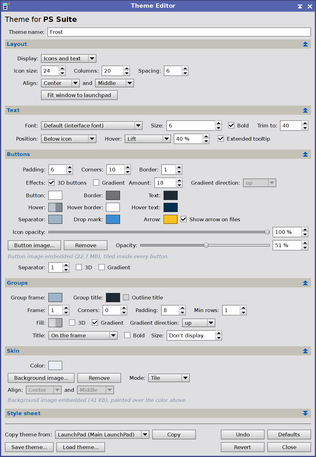
Every setting of the selected launchpad's theme, applied as it is changed.
6.1 Layout
Layout holds what arranges buttons. What a button looks like is in Buttons.
- Display: what a button shows. Icons only, Icons and text, or Text only.
- Icon size: the edge length of a button's icon, in logical pixels before display scaling. 16 to 96.
- Columns: buttons per row, in every display mode. 1 gives a vertical strip; more gives a horizontal bar that wraps onto further rows as items are added.
- Spacing: the gap between buttons, and the inset from the window's edges. Distinct from Padding, which insets a button's content inside that button. 0 to 32.
- Align: where the block of buttons sits when the window is larger than it needs. Horizontally Left, Center or Right; vertically Top, Middle or Bottom. It has no visible effect on a window fitted exactly to the launchpad.
- Fit window to launchpad: shrinks the launchpad window to exactly the space the buttons need, spacing margin included, discarding any size we had dragged it to.
Changing Display, Icon size or Columns refits the window automatically: each of them changes the shape of every button, so the window's old size no longer means anything.
6.2 Text
- Font: the type face for button labels, chosen from the fonts installed on this computer. Default uses PixInsight's own interface font. A theme made elsewhere may name a font this machine does not have: that name is kept and listed here, and the bar falls back to the interface font until the font is installed.
- Size: label size in points, up to 48. Default 8. Below 1 the spin box reads Don't display, and labels are not drawn at all: a size of nothing is how we say no text, rather than a small number. Display follows, switching to Icons only, since a text mode with no text is not a display mode. Choosing a text mode again brings the size back to 8, unless one is already set, in which case it is left alone.
- Bold: draws labels in bold.
- Trim to: the longest label drawn, in characters. 2 to 100, default 40. A longer name is cut here and given an ellipsis, which is added on top of the count: trimming to 8 gives eight characters plus three dots. A name only a character or two over the limit is left alone, since cutting it would produce a longer label than the name itself. Every cell is as wide as the widest label on the bar, so without this one long name sets the width of every button, and lowering the trim narrows the buttons. The tool tip always shows the whole name.
- Position: where the label sits relative to the icon, in icons-and-text mode: Right of icon, Left of icon, Above icon or Below icon. Left and right center the two against each other; above and below stack them and center them across. Changing it refits the window.
- Hover: what the button under the cursor does, beyond taking the hover color. See below.
- Extended tooltip: whether a tool tip carries its second line, saying what the button does. Off leaves the name alone, which is all a familiar launchpad needs.
Hover effects
The amount beside the combo drives all of them: the scale for Magnify, the rise for Lift, the halo's width for Glow, how far Brighten lightens.
- No effect: the hover fill and edge colors only.
- Magnify: the button swells, the way a dock does it. The icon is re-rendered at the larger size rather than scaled up, so it stays sharp.
- Lift: the button rises and casts a soft shadow where it was.
- Glow: a halo outside the button, in the hover edge color.
- Press: the 3D shading inverts and the button sinks.
- Brighten: the fill and border lighten, with no change of geometry. This is the one that cannot overflow into a neighbouring button, which makes it the safe choice in a tight multi-column layout.
6.3 Buttons
Everything about what a button looks like.
- Padding: the gap between a button's edge and its content. 0 to 32.
- Corners: corner rounding for button fills and borders, in pixels. 0 draws square. Up to 24.
- Border: border thickness in pixels, 0 to 6. 0 draws no border at all, whatever the border color says.
- 3D buttons: the border itself is drawn light along the top and left edges and dark along the bottom and right, shaded from the border's own color, so a yellow border stays yellow. With no border to shade, 3D still outlines the button at one pixel, taking its color from the fill.
- Gradient: fills each button with a gradient instead of a flat color, both ends taken from the button color itself.
- Amount: how far the gradient and the 3D shading move away from the base color, 0 to 100. 0 makes both invisible.
- Gradient direction: which way the gradient runs. The end named is the light one: up, down, left or right. Enabled only while Gradient is on.
Colors
Every color is chosen with the Deep Sky Colors picker, and every one has an opacity. Opacity 0 means the element is not painted at all, which is how an optional fill or border is switched off; the picker's None button is the direct way to say that.
A swatch previews its color over the two grounds it will really be seen against: on the left the launchpad's own background, or a piece of the background image when there is one, and on the right a contrasting neutral so that a translucent color reads as translucent.
- Button: the resting fill behind each button. Set it to None for a flat bar.
- Border: the resting outline around each button.
- Text: the label color in the two text modes.
- Hover: the fill under the cursor.
- Hover border: the outline under the cursor.
- Hover text: the label color under the cursor.
- Separator: the color of separator items.
- Drop mark: the insertion marker shown while dragging a button.
- Arrow and Show arrow on files: an arrow drawn near the bottom-right corner of every button that opens a file (an image, a script, anything opened from a path), so it reads as a link to something that lives elsewhere. Process buttons never get one: they hold their instance. On by default. The arrow is a third as long as the icon is wide, never shorter than 15 pixels, and shrinks as a whole to fit a small button. Its edge is black on a light fill and white on a dark one. The color is disabled while the box is off.
Icon opacity
How solid the icons are, independently of every color above. It is its own setting because a translucent button with a solid icon on it is a perfectly reasonable thing to want.
Button image
An image tiled inside every button, over the fill and under the border, and clipped to the button's own shape including its rounded corners. There is no fit mode to choose: a button is small and repeats across the bar, so a texture is the only thing that reads well at that size. It has its own Opacity, so a faint texture over a solid button color is possible. Remove drops it.
Separator
The style of separator items, next to the color that draws them.
- Thickness: the line's thickness in pixels, 1 to 8.
- 3D: lights one edge of the line and shadows the other, the same way 3D buttons work.
- Gradient: fades the separator along its length: left to right for a horizontal one, top to bottom for a vertical one. It uses the buttons' Amount.
6.4 Groups
What a group's frame, fill and title look like, and whether groups draw them at all. These apply to every group on the launchpad at once: Size set to Don't display hides the titles, and Frame set to zero hides the frames.
- Group frame: the color of the frame drawn around a group.
- Group title: the color of a group's title text.
- Outline title: draws group titles with a 1-pixel outline, black around a light title and white around a dark one, so a title reads over any fill or background image. Off by default, and disabled while titles are not displayed.
- Fill: the fill behind a group's buttons, under its frame. Set it to None and the bar shows through.
- 3D: shades the group's frame like a raised button.
- Gradient and Gradient direction: fill the group with a gradient instead of a flat color, running the way the direction names. They use the buttons' Amount.
- Frame: the frame's thickness in pixels, 0 to 6. 0 draws no frame at all: the group still groups, and still carries its title and its fill. With no frame, the controls that only decorate one, 3D and the Group frame color, are disabled. Corners and the gradient stay live, because they shape the fill as well.
- Corners: the frame's corner rounding. Ignored while the title sits on the frame, which needs a straight top edge to break.
- Padding: the gap between the frame and the buttons inside it. 0 to 32.
- Min rows: the fewest rows a group is laid out in, however many columns there is room for. 1 to 20, default 1. A group with room to spare puts everything on one line, which turns six buttons into a long strip; asking for 2 makes the same six a 3x2 block. It is a minimum rather than an exact count: six buttons over four rows is not a grid, so the layout gets as close as the item count allows.
- Title: where the title sits. On the frame breaks the frame's top edge behind the text, the way PixInsight's own group boxes do it. Above the frame puts it on its own line.
- Bold and Size: the title's weight, and its size in points. Default 8. Below 1 the spin box reads Don't display and group titles are not drawn. The group still groups, and its frame and fill are unaffected.
6.5 Skin
The launchpad's ground: a color, and optionally an image over it.
- Color: the bar's ground, painted under everything else. This is what shows when there is no background image.
- Background image...: a wallpaper painted behind the buttons, over the background color. Remove drops it and the bar goes back to the flat color.
- Mode: how the image fills the window.
- Stretch fills the window exactly and does not keep the image's proportions.
- Fit shows the image as large as it can while keeping its proportions, and the alignment below places it in what is left over.
- Tile and Center use the image at its own size.
- Align: where a fitted image sits in the space its proportions leave over. Enabled only for Fit: Stretch leaves nothing over, and Tile and Center place themselves.
Images are embedded in the theme, not referenced by path, so a theme file and an exported process icon carry their own artwork and survive being copied to another machine. The ceiling is 24 MB for a background image and 4 MB for an icon. A background image is worth sizing sensibly: every byte of it is copied into every configuration we save and every process icon we export.
A skinned launchpad:
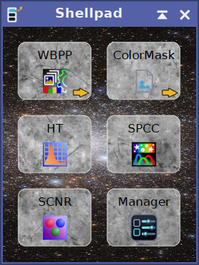
A background image behind the buttons, and a texture inside each of them.
6.6 Style sheet
A Qt style sheet applied to the Manager window and the Theme Editor, so that a theme can style its own chrome to match the bar. For example:
QWidget { background: #1B2A3E; color: #E4EEF8; }
QTreeView { background: #16222F; alternate-background-color: #1B2A3E; }
Two more to try. A warm, light alternative, with the item list a shade brighter than the window so it reads as a panel:
QWidget { background: #F2EDE1; color: #3A2F21; }
QTreeView { background: #FFFCF4; alternate-background-color: #F7F1E4; }
QHeaderView::section { background: #E4D9C3; color: #3A2F21; padding: 3px; }
These define the buttons and fields on their own:
QPushButton { background: #2B3444; color: #E8EEF6; border: 1px solid #5A6472;
              border-radius: 4px; padding: 3px 10px; }
QPushButton:hover { background: #38455A; }
QPushButton:disabled { color: #7A8290; border-color: #3A424F; }
QLineEdit, QSpinBox, QComboBox { background: #16222F; color: #E4EEF8;
                                 border: 1px solid #3A4A5C; }
It does not reach the launchpad. The bar is custom-painted end to end, and a style sheet on a control whose paint handler draws everything is simply overpainted. The launchpad's own appearance is what every other setting on this page is for.
6.7 Theme files
- Copy theme from: takes a whole theme from another launchpad. The combo lists every other launchpad there is, and Copy applies its theme here. Only the theme travels: this launchpad keeps its buttons, its name and whether it is hidden. It is a copy rather than a link, so changing the other launchpad afterwards does not change this one. The row is disabled while this is the only launchpad, and the theme being replaced is kept as a restore point first.
- Save theme...: writes this theme, including any embedded images, to a
.pilpthemefile. - Load theme...: replaces the current theme with the one in a file. Settings a file does not mention take their default value rather than keeping whatever the previous theme had, because a theme file is a whole look.
- Undo: undoes the most recent change to the theme. The button then reads Go back, which puts that change back again; after any other change it reads Undo once more. Undo reaches back one change only, and only a change to the theme: when the most recent change was to the launchpad's buttons, it says there is nothing to undo. For anything further back, Restore... in the Manager.
- Defaults: restores every setting on this page to the built-in look.
- Revert: puts the launchpad back the way it looked when this window was opened, discarding every change made since.
- Close: closes the Theme Editor. Changes are already applied and saved.
Loading a theme, restoring defaults and reverting all refit the launchpad window, since each of them brings a whole layout with it. Loading a theme, restoring defaults and Undo each keep a restore point first, so none of them is a one-way door; see 5.5.
7 The theme pack
[hide]
The module ships 28 themes, under src/scripts/PILaunchPad/themes in the PixInsight installation. They are loaded from the Theme Editor, and loading one changes how a launchpad looks and nothing about what is on it, so trying them costs nothing.
7 of them are the Relaxing family: one compact layout in several palettes, so moving between them changes the colors and leaves every button where it was.
One button per row
These make a launchpad a narrow vertical strip, which suits a launchpad of a few buttons: a long one becomes a tall column. Raising Columns in the Theme Editor turns any of them into a grid that wraps, so the shape is a starting point rather than a decision.
| Carbon | Icons on near black, with no button behind them and no border. The most minimal thing here, and the one that disappears into a dark desktop. |
| Field Notebook | Brown leather and warm ink, labels beside the icons. Bookish and calm. |
| Frost | White ice, wide spacing, rounded buttons that swell under the cursor. Airy and bright. |
| Oxide | Rusted iron under the heaviest bevel in the pack. Chunky, industrial, unmistakably physical. |
| PixInsight Dark | Deliberately unremarkable: flat, no gradient, no hover, PixInsight's own greys, so the launchpad reads as part of the application rather than as something added to it. |
| PixInsight Light | The same, drawing no background of its own, so PixInsight's window shows through and it follows whatever theme is set. |
| Relaxing Aurora | Near black with teal and violet accents, like the sky it is named after. |
| Relaxing Blood | Deep oxblood reds. Dark, and a little severe. |
| Relaxing Blue Sky | The light one: white buttons on pale blue, crisp and plain. |
| Relaxing Dark | The quiet one: small icons with their labels beside them, a soft edge, nothing to look at but the buttons. Made for having on screen all day. |
| Relaxing Green Grass | Forest greens, easy on the eye beside an image being worked on. |
| Relaxing Light | The same strip for a bright desk, and softer still. |
| Relaxing Sunset | Dusk purple under warm orange, the friendliest of the family. |
| Smooth and tiny | Words only, six point, tightly packed. A compact menu rather than a toolbar, for tools we know by name. |
Grids
These already spread their buttons over several columns, and suit launchpads with more on them.
| Babe | A good looking theme like no other, and the name is doing some of the work. A photograph shows through translucent buttons, with a press-in hover that gives it a little bounce. Set it once: we will know straight away whether it is staying. |
| Carina | The Carina Nebula behind semi-transparent buttons. Colorful, and the one to show someone. |
| Lunar | A full Moon behind, regolith on the buttons, which rise as the cursor crosses them. |
| Mercury | Lunar's colder cousin: a cratered grey world, an amber accent, and a halo under the cursor. |
| Mystic Mountain | The Hubble pillar in teal and gold, small icons over a tiled frame so the image stays sharp. |
| Observatory | A star field with steel mesh buttons and a cold cyan accent. The observatory at night. |
| SpaceTruckin | A ringed planet and a globular cluster, icons only, labels trimmed hard. The most science fiction of the pack. |
| USA | Stars and stripes behind two columns of firm navy buttons, the flag reading faintly through them, each brightening as the cursor crosses it. Ceremonial, and not subtle. |
| Compact Latte | Small icons in five columns on polished stone. The densest grid here, for fitting many tools into little space. |
| Indigo | Denim, stitched and faded, in a six column block. Casual and solid. |
| Living Room | Dark polished mahogany, large rounded icons that swell on hover. Warm and domestic. |
| Marbled | Pale grey marble, bright and formal: small white buttons in a wide band, tiny bold labels, and a lift under the cursor. The light counterpart to Snowstone. |
| Snowstone | A wide pale band of snow and stone with small labelled buttons, for a launchpad that spans the screen. |
| Carpentry | A workbench: planks behind, sawn timber on the buttons, one long row of big icons that lift as the cursor passes them. |
A starter launchpad of 15 common PixInsight processes is included as well, as Starter-15-processes.pilp. It carries no theme data at all, which makes it a neutral launchpad for trying the themes on.
Textures and astronomical images are not part of the module. They are offered separately, as a free download, and can be kept anywhere: the Theme Editor browses to a folder of our choosing for a button texture or a launchpad skin, so where they live is our decision rather than the installer's. The pack is at:
https://www.deepskycolors.com/pixinsight/PILaunchPad/
The shipped themes:
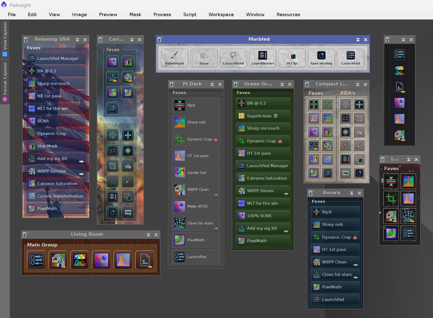
A few of the themes that ship with PI LaunchPad, on the same launchpad.
8 Where everything is stored
[hide]
The launchpads live in a PILaunchPad folder under PixInsight's per-user configuration directory. On Windows that is typically:
%AppData%\Pleiades\PILaunchPad\
toolbar.pilp | The Main LaunchPad: its name, its items and its theme. |
toolbar-2.pilp ... | One file per additional launchpad, numbered the way they are counted. |
toolbar.pilp.previous ... | The generation before the current one, one per launchpad: toolbar-2.pilp.previous and so on. Every save keeps one. |
RestorePoints\ | The restore points: up to ten per launchpad, each an ordinary launchpad file named after its launchpad and the time it was kept. |
Each launchpad carries its own name and its hidden flag inside its own file, and which launchpads exist is worked out by looking at the folder. There is deliberately no separate index: an index would be a second copy of the truth, and when the two disagreed there would be no way to tell which was right.
The launchpad is written after every change rather than at shutdown, because a module interface is not guaranteed a clean teardown: PixInsight can be closed, or fail, with the window still open.
Previous generations and restore points exist so that no way of replacing a launchpad is a one-way door, and Restore... in the Manager brings any of them back. A restore point is an ordinary launchpad file, so Load configuration... can open one directly as well.
These are plain text files. A launchpad that exists but cannot be read is never overwritten with an empty one: the console reports it and saving is refused until the problem is resolved, so the file survives for inspection.
Themes, configurations, skins, button textures, added files and item icons each remember the folder they were last used in, so the file dialogs open where we were working.
9 Usage tips
[hide]
- Capture the instance, then delete the icon. A process item stores the instance's own definition, so the workspace icon it came from is free to be deleted once the button exists. That is the whole point of the module: the workspace stops being the filing cabinet.
- One launchpad per job. A wide labelled launchpad for calibration and a discreet strip for stretching can be on screen at the same time, each with its own theme. Hiding the ones a session does not need keeps them out of the way without losing anything.
- The whole set can travel as a process icon. The Manager window carries the drag triangle, and the icon it makes carries every launchpad, so the set can be saved in a project, moved to another computer, or sent to someone else.
- A launchpad is also a way to share. Anyone who shares process icon collections or script bundles can offer them as a launchpad: every button named and arranged, grouped into a workflow, and branded with a skin, custom icons and button textures, all of which travel embedded in the file. A configuration file, from Save configuration..., is the format to share: it goes into whichever launchpad the recipient loads it into, typically a new one made with New LaunchPad. A LaunchPad process icon is less suited to sharing, because it carries every launchpad and puts each back in its own slot, replacing the recipient's own launchpads there. Process buttons travel complete; script and file buttons store a path, so they work only where that file sits at the same place on the recipient's computer. A recipient without a license gets the free tier: one launchpad, five buttons.
- Groups without frames still group. Turning off group titles and frames in the Theme Editor leaves the grouping, the row break and the ordering intact. It is a way to structure a launchpad quietly.
- Text modes take columns too. A three-column list of labelled buttons is often more readable than a long single column, and wastes less screen.
- Brighten is the safe hover effect. Magnify and Lift move geometry and can overlap neighbours in a tight grid; Brighten cannot.
- The first five are the live ones. On the free tier the cap follows the Main LaunchPad's order, not the order things were added, so moving a button up the list is how we choose which five launch. Nothing is lost either way.
- Keep skins modest. A background image is embedded in the theme and copied into everything the theme touches. A picture sized for the bar beats a full-resolution photograph.