1 Introduction
[hide]
PI ThemeStudio changes how PixInsight looks. Colors, icons, wallpapers, fonts, frames, the shape of a tab — all of it, either from a list of ready-made themes or from a theme we build ourselves.
Before we change anything, one point deserves to be made plainly: PI ThemeStudio only changes appearance. It writes a style sheet, icon resource files, wallpapers and a handful of PixInsight’s own appearance settings. It does not touch our images, our processes, our process icons, our projects, our file formats, or any preference that governs how PixInsight works. After a theme is applied, every process does exactly what it did before, with the same parameters and the same results. Only the paint is different.
This document has five parts. Section 2 is for finding a theme, putting it on, and knowing how to get back — most of us need nothing else. Section 3 is for building themes: every control of the Theme Editor, tab by tab. Sections 4 to 7 cover backups, tools and preferences, the remaining corners and the license, and Section 8 documents the palette file itself, for the few who edit a theme by hand. Section 9 shows how to have an AI assistant write a theme.
2 Choosing a Theme
[hide]
PI ThemeStudio ships with 80 complete themes in eight categories, from quiet light ones to a dim red observatory theme meant for a night under the stars. Selecting one shows it in the preview; applying it puts it on.
2.1 The Manager
The PI ThemeStudio Manager —
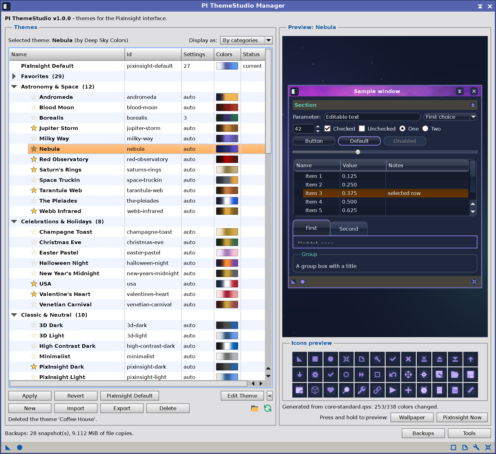
The theme list on the left, the live preview on the right, and the buttons that act on the selected theme. The preview folds away with the < button at the end of the Apply row.
The Manager is PI ThemeStudio’s main window, the one that opens with the process. It has three areas: the theme list, the live preview, and the buttons that act on the selected theme. Under the list, a status line reports the last action; at the bottom, a summary counts the snapshots and the space they take.
The theme list shows one row per theme:
| Name | The theme’s name, as its author wrote it, with its favorite star before it. Click the star to star or unstar the theme. A favorite is a gold star, outlined so it reads on any theme; a theme that is not one shows the same star, faint, blending into the row. Only the star toggles: a click on the name selects the theme as always. Favorites are remembered between sessions, and Display as can bring them to the top. |
| Category | The group the theme belongs to. A theme with none is in Other. |
| Id | The folder the theme lives in. We use this id when a process icon applies a theme. |
| Settings | How many settings the theme’s theme.txt writes; auto for a theme built from a palette, whose settings come from its rules when it is applied. The rules are what the Theme Editor sets and keeps in the theme’s palette.txt — how colors change, the colors chosen by hand, wallpapers, icons, the drop shadow and the checkerboard. The count depends on the rules, so it is not known ahead of time. |
| Colors | The theme at a glance: its background, then its frame color (a dark theme) or panel color (a light one) — or its title bar, when that says more — then its accent, blending into each other. |
| Status | current for the theme in force, applied, restart pending until PixInsight restarts with it, and INVALID when it cannot be applied: hold the mouse over it for the reasons. |
Selected theme, above the list on the left, names the theme selected and its author.
Display as, above the list on the right, shows the themes A-Z by name, A-Z Fav first (the starred themes first, each group A-Z), or By categories: one group per category, A-Z, with Other last, each opening and closing with a click and showing how many themes it holds; the Category column is hidden in this view. PixInsight Default stays at the top either way, and the choice is remembered. When at least one theme is starred, a Favorites category opens the tree. It is a view of the stars, not a category a theme belongs to: a starred theme is listed there and stays in its own category. The stars are ours, not the themes’: no theme.txt records one, they are a preference of yours, and a star whose theme is gone is dropped the next time the list is read. Favorites cannot be renamed, and no other category may take its name; a theme leaves it when its star is clicked. Choosing Favorites as a theme’s category, in the Theme Editor or when creating a theme, stars it instead and leaves its category alone. Double-click a category to rename it: every theme in it follows, and a name another category already has merges the two, after asking. Other has no name of its own to change. Double-click a theme to apply it (Apply asks first, as always); on an INVALID theme, a double-click lists its problems instead.
The preview on the right draws a sample interface with the selected theme — a title bar, a section bar, the usual controls, a list, a group box, a tool button bar, and a table of 36 icons as the theme draws them. The sample window sits on the workspace as the theme would paint it: its first wallpaper, or its workspace color when it shows no wallpapers. Below it, two buttons preview while pressed and held: Wallpaper hides the sample window to show the whole workspace, and PixInsight Now shows the sample, and the icons, as PixInsight looks now. Nothing has been applied at this point: the preview is a rehearsal. The < button folds it away when we want the list wider.
The buttons act on the selected theme:
| Apply | Put this theme on. |
| Revert | Undo the last apply. |
| Edit Theme | Open the Theme Editor on this theme. Not available for PixInsight Default or for a theme from a licensed theme pack. |
| New | Start a theme of our own: its name, its author, its category (one the themes already use, or a new one typed in), and whether it starts as PixInsight Default, PixInsight Dark or PixInsight Light. |
| Import | Install a .pitheme package into the theme list, or a theme folder: choose the theme.txt inside it. Nothing is applied. |
| Export | Save the theme as a .pitheme package. A theme that ships with PI ThemeStudio, or one imported from someone else, is exported as a copy under a name and author of our own. PixInsight Default and themes from a licensed theme pack cannot be exported. |
| Delete | Remove the theme from the theme list, with its folder. This cannot be undone, so export it first to keep a copy. If it is the theme in force, PixInsight keeps using it until another is applied, though it can no longer be regenerated after a PixInsight update. A theme that ships with PI ThemeStudio comes back with Tools > Reinstall Built-in Themes. PixInsight Default cannot be deleted. |
| PixInsight Default | Go back to PixInsight’s own look. |
| Backups | Every snapshot, and how to restore one. See Section 4. |
| Tools | The extras, and PI ThemeStudio’s preferences. See Section 5. |
| Folder icon | Open the themes folder. |
| Refresh icon | Read the theme list again, after a theme folder was changed by hand. |
2.2 Applying a Theme
Keep or revert, at the next start —
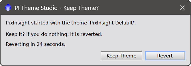
The question PI ThemeStudio asks the first time PixInsight starts with a new theme. Saying nothing reverts it.
Select a theme and press Apply. The question lists nothing itself: Details shows every setting and file that will change, and any warnings. After we confirm, PI ThemeStudio does four things, in this order:
- Takes a snapshot of everything the theme is about to change.
- Deploys the theme’s files into a folder of their own, and verifies every copy.
- Writes its settings, then reads them back to confirm they took.
- Brings the documentation style sheets inside the PixInsight installation in line with the theme: writes them if the theme asks for them, or puts back the originals an earlier theme changed. Both are skipped when Don’t style: PixInsight Documentation is on (Section 5.2), except by PixInsight Default, which always puts the originals back. This step, and the removal of Script Fixes by PixInsight Default, are the only ones that need administrator rights; see Section 6.2.
Most of the change only shows after a restart. PixInsight reads its style sheet and icon resources once, at startup, so the new look arrives the next time we start it, not while we watch.
2.3 Only the Look Changes
What a theme may write is a closed list:
- The core style sheet PixInsight uses to paint its interface.
- Icon resource files.
- Workspace wallpapers.
- The image transparency checkerboard.
- The window drop shadow, its color and its blur radius.
- The documentation style sheets, when the theme asks for them.
- The interface fonts.
- Window effects: opacity and translucency, shadows on icons and child windows, dark drag cursors, and the native file dialogs and menu bar.
Nothing else is written. Our images, processes, process icons, projects, file formats, directories and every preference that governs behaviour are neither read nor touched. Functionality is exactly the same before and after a theme; what changes is which colors PixInsight paints with.
2.4 Five Ways Back
No software can promise that nothing will ever go wrong, and a theme is certainly capable of making PixInsight unpleasant to look at. What PI ThemeStudio does promise is that coming back is easy, and that it does not depend on any single mechanism working:
- Do nothing. Applied a theme, restarted, and it is wrong? Let the countdown run out. It reverts by itself.
- Revert undoes the last apply, from the Manager.
- PixInsight Default returns the interface to PixInsight’s own look: core style sheet and icons, default wallpapers, transparency and drop shadow, any font or window effect a theme set, and the original documentation style sheets. Any Script Fixes are removed as well, so every script is back in its original form. It is an apply like any other, so it takes a snapshot first and offers the same keep-or-revert at restart.
- Backups. Every apply leaves a snapshot behind, and the first one PI ThemeStudio ever took — the baseline — is PixInsight exactly as it was before any theme existed on this machine. Any snapshot can be compared with the current state and restored.
- The offline recovery script in the snapshot folder (
recover.baton Windows,recover.shon Linux and macOS). This one runs outside PixInsight, for the case where PixInsight itself cannot be used. See Section 4.3.
The first four are a click. The fifth exists so that even “I cannot see the buttons any more” has an answer.
2.5 A Few Easy Changes
A theme we like, but not quite? Select it, press Edit Theme, and change one thing. The preview follows as we type, and nothing is applied until we save and apply. These are the handful most of us want:
| Font > Size (Look) | The base size of the interface font. Every other size follows it. |
| Corners (Look) | How round buttons and tabs are, from square to 8 pixels. |
| Icon style (Images) | A design element on every core icon: a plate behind it, an outline around it, one color across it, or bevelled edges. |
| Skins (Images) | An image tiled behind panels, dialogs or title bars, in place of their flat colour. |
| Wallpapers (Images) | Whether the theme recolors the workspace wallpapers or leaves them alone. |
| Drop shadow (Extras) | The shadow behind each window, and how far it reaches. |
| Keep PixInsight’s colors (Image Area) | Whether the image canvas, previews and console take the theme, or stay exactly as PixInsight draws them. |
Everything the editor offers is documented in Section 3.
3 The Theme Editor
[hide]
The Theme Editor —
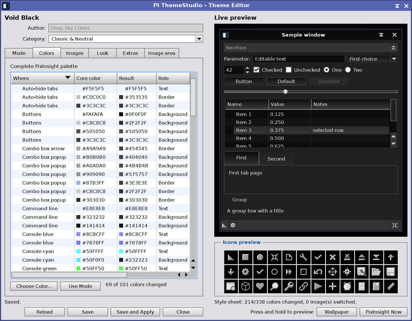
The tabs on the left, the live preview on the right, and the splitter between them.
The Theme Editor is where a theme is built. It opens from Edit Theme in the Manager, and by itself whenever New creates a theme. On the left are six tabs — Mode, Colors, Images, Look, Extras and Image area — and on the right a live preview that redraws as we change anything. Nothing reaches PixInsight until the theme is saved and applied.
3.1 The Window
Which theme: the editor opens on the theme selected in the Manager’s theme list (Section 2.1), with Edit Theme. To edit another, select it there and press Edit Theme again.
Theme name: at the top, in bold. It cannot be changed here: a theme gets its name when New creates it, or when a copy of it is exported under a name of our own.
Author: who made the theme. It can be changed for a theme made here. For a theme that ships with PI ThemeStudio, or one imported from someone else, it is shown but fixed.
Category: the group the theme is listed in when the list shows categories. Pick one the themes already use, or type a new name to create one; either moves this theme only. Empty puts it in Other. It can be changed for any theme. To rename a category itself, double-click it in the theme list.
Live preview: a sample window drawn with the theme as it stands — its title bar and frame, a panel of typical controls — on the workspace, with the theme’s first wallpaper, or its workspace color when it shows no wallpapers. Below it, two buttons preview while pressed and held: Wallpaper hides the sample window to show the whole workspace, and PixInsight Now shows the same sample as PixInsight looks right now, for comparison. Under the preview, Icons shows 36 icons as the theme draws them — PixInsight Now puts PixInsight’s own in their place while it is held — and a status line counts the colors changed and the images switched. When a window title would be too faint on its title bar, the line adds Title text too faint: adjusted: PI ThemeStudio has already made the title readable, and the tooltip gives the contrast figures (Section 8.6).
Splitter: the bar between the tabs and the preview. Dragging it gives the tabs more room; the preview keeps its width.
Reload: discards the unsaved changes and reads the theme again, after asking when there are any.
Save: writes the theme: its rules to
palette.txt, keeping the previous version alongside aspalette.txt.bak, and its author and category totheme.txt. Ifpalette.txthas lines the editor does not understand, it says so when the theme opens; those lines are not kept when the theme is saved.Save and Apply: saves, then applies the theme exactly as Apply in the Manager does — the same confirmation, and the same keep-or-revert question at the next start.
Close: closes the editor; if there are unsaved changes, PI ThemeStudio then asks whether to save them, and No discards them. Opening another theme with unsaved changes asks the same, with Cancel as well.
3.2 Mode
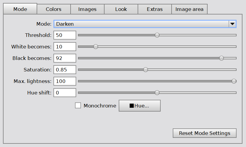
The Mode tab sets the general rule: how every color of PixInsight’s interface changes, unless it is chosen by hand in the Colors or Image area tabs. Lightness here is perceived lightness (L*), from 0 (black) to 100 (white).
Mode:
Darken: backgrounds, borders and other colors lighter than the threshold, and text darker than it, have their lightness turned around while their hue is kept. Areas PixInsight already draws dark stay dark. This is how a light interface becomes a dark one without turning into a photographic negative.
Map lightness (all colors): every color’s lightness is mapped anew: white becomes the first value below, black the second. A softer light theme, or a dark one, depending on the two values.
None: every color stays as PixInsight draws it, unless it is chosen by hand.
Threshold: Darken only. The lightness that divides light from dark: lighter backgrounds and borders, and darker text, are turned around. Range 0 to 100.
White becomes and Black becomes: what white and black turn into, so that a dark theme need not reach pure black, nor a light one pure white. Range 0 to 100. Not available with None.
Saturation: of the colors the mode turns around. 1 keeps their saturation; lower values mute them, higher ones make them more vivid. Range 0 to 2. Most of PixInsight’s colors are grays, which have none, so it mostly shows on the tinted ones — hover, selected rows, accents. Not available with None, nor with Monochrome, which sets the saturation itself.
Max. lightness: scales down the lightness of every color the mode decides, so that white reaches this value and the whole interface dims in proportion. At 100 it does nothing. Colors chosen by hand in the Colors and Image area tabs are not affected. Together with Monochrome, it is what makes a red night-vision theme.
Monochrome and Hue: every color the mode decides takes the one hue chosen with Hue (choosing one turns Monochrome on), keeping its own lightness.
Hue shift: turns the hue of every color of the theme, the icons’ included, from −180 to 180 degrees — the colors chosen by hand too, in the Colors tab and in the Images, Look and Extras tabs (icon styles and background, frames, group boxes, drop shadow, checkerboard), so the whole theme moves together. Grays have no hue and stay gray. The image area keeps its colors when Keep PixInsight’s colors is on. Not available with Monochrome, which sets the hue itself.
Reset Mode Settings: puts this tab back to the theme’s own values — as it ships, for a theme that comes with PI ThemeStudio; as last saved, for any other. The other tabs keep what we have done in them.
3.3 Colors
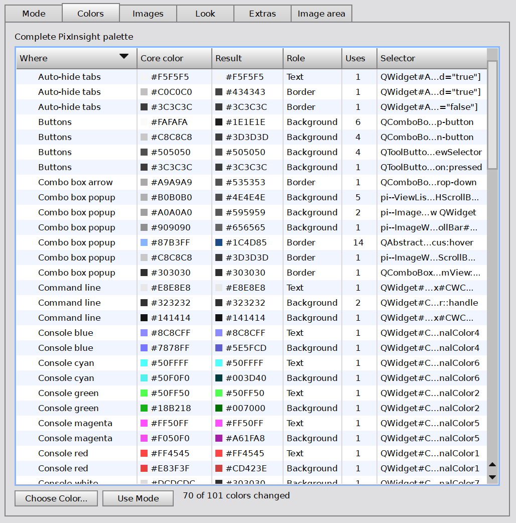
The complete PixInsight palette: every color in PixInsight’s style sheet, one row each, with the color the theme gives it. Most themes never need this tab — it is for the one color the mode does not get right.
Where: what it paints, in plain words.
Core color: the color as PixInsight draws it.
Result: the color it becomes with this theme. Colors we have chosen by hand are marked chosen; the others follow the Mode tab.
Role: what the color is used for — text, background, border, or anything else. The same color can appear once for each role, and each can be changed on its own.
Uses: how many times the color appears in PixInsight’s style sheet.
Selector: the style sheet rules behind it, for the curious.
Sorting: the table starts sorted by Where, A to Z. Click a column header to sort by that column; click it again to reverse the order.
Choose Color (or a double-click on a row): picks the color by hand. From then on the mode no longer decides it, wherever that color is used in that role.
Use Mode: forgets the chosen color, so the Mode tab decides it again.
Next to the buttons, a count shows how many of the palette’s colors the theme changes.
3.4 Images
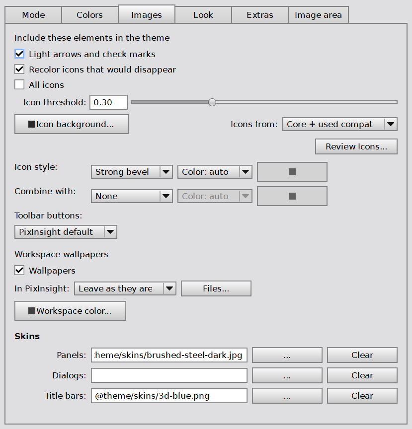
Everything in a theme that is a picture rather than a color: the small images inside controls, the icons, the wallpapers, and skins.
Icons
Light arrows and check marks: the arrows of combo boxes, spin boxes and scroll bars, and the check marks, are small dark images drawn for PixInsight’s light interface. With this on, the theme uses PixInsight’s own light versions of them, wherever they exist at every screen scale. Nearly every dark theme wants it.
Recolor icons that would disappear: an icon drawn for a light background can all but vanish on a dark one. With this on, PI ThemeStudio recolors exactly those icons, through the theme’s rules, and leaves every other icon alone.
All icons: recolors every icon, not only the ones that would disappear. PixInsight’s splash art and application icon are not icons of the interface: they stay as they ship. The startup splash and the application icon are the exception when the theme is Monochrome with a clearly colored hue — then they are tinted with it, keeping their own light and dark, never inverted. The About and Acknowledgements images follow the same rule when Tools > Preferences > Don’t style: About and Acknowledgements splash images is off; it is on by default, and they then stay as they are. The activation logo always does. A rule in Review Icons that names one still decides for it.
Icon threshold: how much of an icon must be lost against the icon background before it is recolored, as a share of its visible pixels, from 0 to 1. Lower values recolor more icons.
Icon background: the color icons are judged against — normally the theme’s own panel color.
Icons from: which of PixInsight’s icons are included. Core is PixInsight’s own set. Core + used compat adds the older compatibility icons that installed scripts actually use, and Core + all compat adds every one of them.
Review Icons: every icon, before and after, in a window of its own. Show filters them: changed, flagged, unchanged or all. For the selected icons, Auto lets the theme decide, Keep keeps the original, Recolor always recolors, Tint… gives them one color and Replace… uses an image of our own. Done keeps these rules in the theme; Cancel discards them.
Icon style: a design element added to every core icon — Plate (a tile behind it), Outline (a halo around it), Duotone (one color across it), Bevel (bevelled edges) or Strong bevel (the same edges, deeper and two pixels wide, for artwork where the plain bevel disappears at small sizes). Color: auto takes the style’s color from the icon background; Custom and the swatch next to it choose our own.
Combine with: a second style over the first, with a color of its own. The same style in both counts once. They combine in a fixed order: duotone recolors the icon, bevel and outline work its edges, and a plate goes behind all of it.
Toolbar buttons: more room around the icons in PixInsight’s main tool bars, from 16 to 32 pixels, or PixInsight default. The icons themselves keep their size: PixInsight sets it in its own code, so the room around them is what a theme can change.
Workspace wallpapers
Wallpapers: recolors PixInsight’s own workspace wallpapers through the theme’s rules. Off: PixInsight’s wallpapers as they are.
In PixInsight: whether PixInsight shows wallpapers at all — Leave as they are (whatever it is set to now), Show wallpapers, or Plain background.
Files: an image of our own for any of PixInsight’s ten wallpapers, in SVG, PNG or JPEG. PI ThemeStudio offers to copy it into the theme, so an exported theme carries it along.
Workspace color: the color of the workspace itself, which shows wherever no wallpaper covers it.
Skins
Panels, Dialogs and Title bars: an image tiled behind process interface panels and tool windows, behind modal dialogs and message boxes, or behind the title bar of every workspace window, in place of their flat color. The … button chooses the image, and Clear goes back to the theme’s color.
The image can be a PNG, a JPEG, or an SVG; an SVG tile needs its own width and height, which set the size of the tile.
A chosen image is copied into the theme’s own skins folder, so the theme can be exported whole and works on another machine. Clearing a skin, or choosing a different image, keeps the previous one next to it with a .bak ending — one backup, overwritten by the next change.
A theme that sets a panels skin and leaves dialogs empty paints dialogs with the panels skin too, since PixInsight gives both the same identity. That is consistent rather than accidental.
3.5 Look
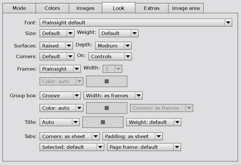
The shape of things, rather than their color.
Font: any font installed on this computer, or PixInsight default. PixInsight’s own font stays as the fallback, for instance on another machine where the chosen font is missing.
Size: the base size in points, from 7 to 16, or Default. Every other size in the interface scales with it.
Weight: Light, Normal, Medium, Semibold or Bold, or Default. Titles PixInsight draws bold stay bold.
Surfaces: Flat, Raised or Glossy — gradients on buttons, tabs, headers and handles, in the theme’s own colors. Depth and On are available once a surface is not flat; Corners also with Theme frames, or a Line group box whose corners follow the frames.
Depth: how far a gradient goes: Subtle, Medium, Strong or Extra.
Corners: rounded corners, from 0 to 8 pixels, or Default.
On: Controls only, or Everything, which gives panels, dialogs, menus and bars a soft gradient too.
Frames: who draws the frames of buttons, edit fields and lists — PixInsight, with its own bevelled images, or the Theme, with a line that follows the corners above. With Theme:
Width: 1, 2 or 3 pixels.
Color: auto derives it from the button color; Custom and the swatch choose our own. Hover and focus always use the theme’s accent color.
Group box: the frame around a titled group — PixInsight, Line, Groove, Ridge (the last two bevelled) or None.
Width: as frames, or 1 to 3 pixels. Groove and ridge always take 2 or more.
Color: auto, the frames’ color, or Custom.
Corners: as frames, or 0 to 8 pixels. Line only.
Title: the title’s color, Auto or Custom, and its weight: default, Bold or Normal.
Tabs:
Corners: the rounded top corners of each tab, from 0 to 8 pixels, or as sheet, as PixInsight draws them.
Padding: the room inside a tab, from 3 to 10 pixels, or as sheet.
Selected: how the current tab stands out — default, bold, underline or raised.
Page frame: the frame around the page under the tabs — default, none, or an accent line.
3.6 Extras
The Extras tab —
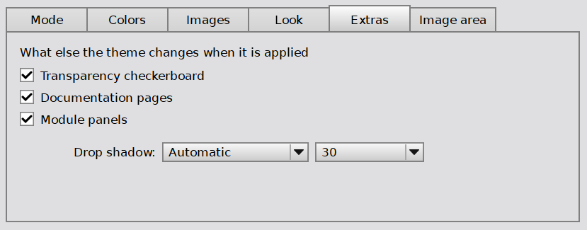
The transparency checkerboard, documentation pages, module panels and the drop shadow.
What else the theme changes when it is applied.
Transparency checkerboard: the checkerboard PixInsight shows behind the transparent parts of an image, recolored through the theme’s rules. Off: PixInsight’s own.
Documentation pages: PixInsight’s documentation, this page included, in the theme’s colors. Off: the original pages. The documentation lives inside the PixInsight installation, so changing it asks for administrator rights; see Section 6.2. Tools > Preferences > Don’t style: PixInsight Documentation overrides this for every theme.
Module panels: plain panels in tool windows that nothing else paints — the sections of Preferences, and some modules’ panels — take the theme’s background.
Drop shadow: the shadow behind windows — PixInsight default leaves it as it is set, Automatic derives it from the theme, and Custom color chooses one, transparency included.
Blur: how far the shadow reaches, from 0 to 64 pixels, or as set, which leaves this computer’s own setting alone. A theme that sets a blur gives the shadow the same size on every machine.
3.7 Image Area
The Image area tab —
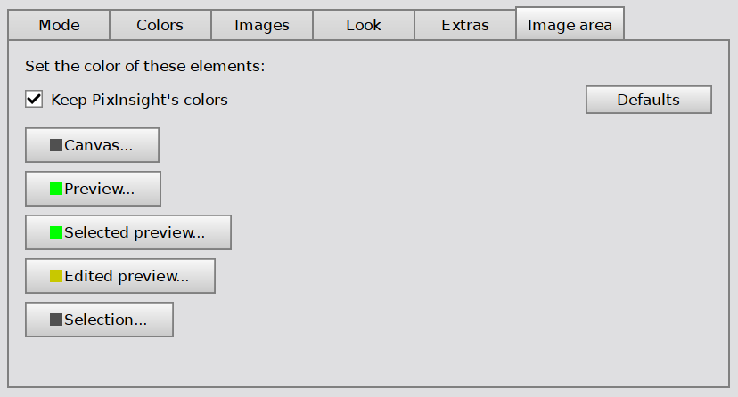
The image canvas, previews and selection: as PixInsight draws them, or in colors of our own.
The area where we work on our images: the canvas behind an image, the previews on it, and the selection. The color of the workspace itself is set in the Images tab, next to the wallpapers that cover it.
Keep PixInsight’s colors: the image canvas, previews, cursors, floating readouts, the Process Console and the workspace stay exactly as PixInsight draws them, whatever the mode or the Colors tab say. The colors chosen below, and Workspace color in the Images tab, still apply.
Canvas, Preview, Selected preview, Edited preview and Selection: each chooses one color by hand — the background behind an image, the frame of a preview, of the selected preview and of a preview being edited, and the selection.
Defaults: clears the colors chosen here.
Keeping the image area is the conservative choice, and a defensible one: the picture we are working on, and the background it sits against, stay as PixInsight designed them, however dark or loud the rest of the interface becomes.
4 Backups
[hide]
Every change PI ThemeStudio makes is preceded by a snapshot, and the Backups window is where those snapshots are compared, restored, kept or removed.
4.1 Snapshots
The Backups window —
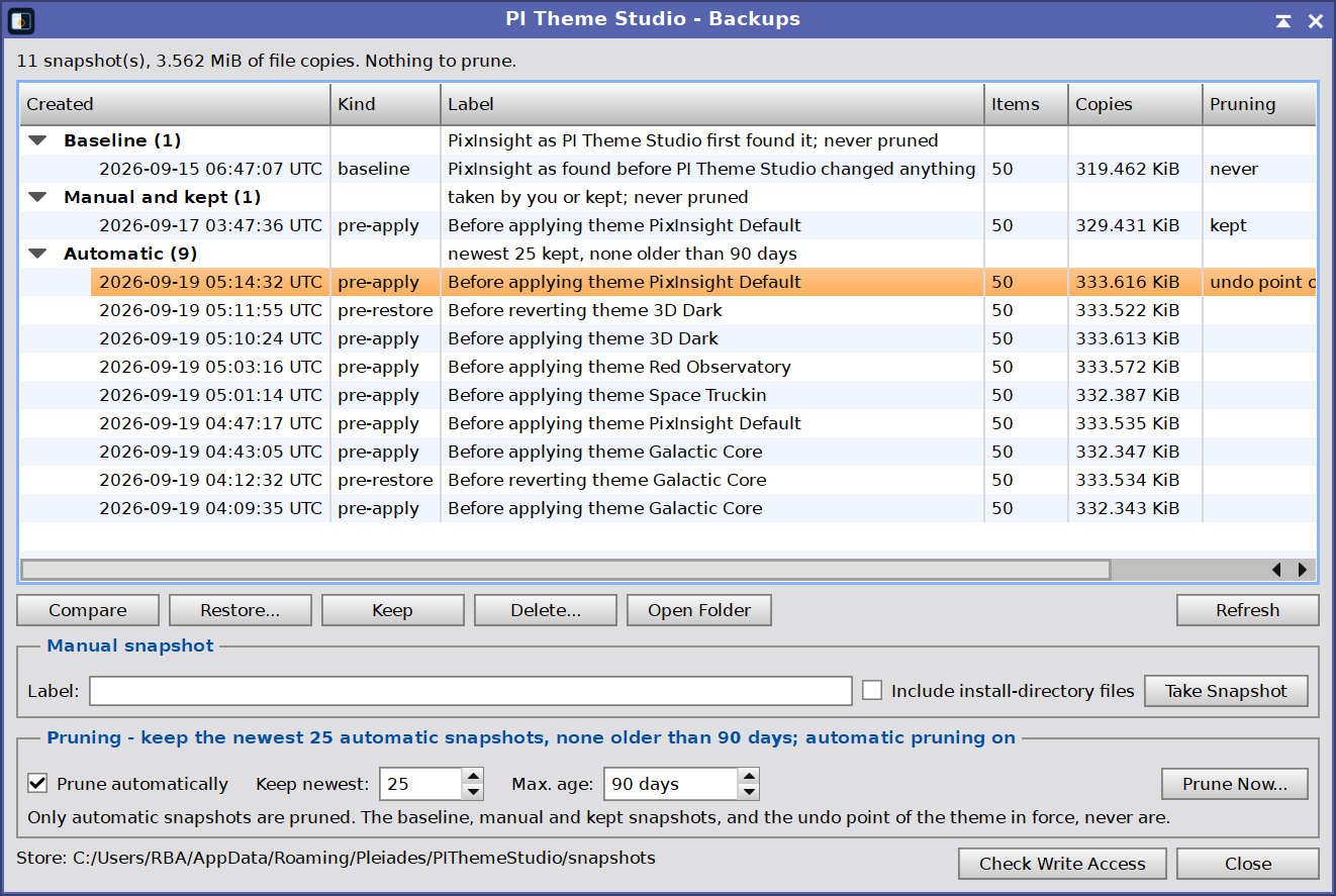
Every snapshot, grouped and newest first, with compare, restore, keep and delete.
Snapshots are listed newest first, in four groups:
| Baseline | PixInsight as PI ThemeStudio first found it, before any theme. Never pruned. |
| Manual and kept | Snapshots we took ourselves, and automatic ones we marked Keep. Never pruned. |
| Automatic | Taken before every apply, before every restore, and after a PixInsight update (Section 6.4). These are the ones pruning removes. |
| Incomplete | Captures that failed. Removed after a day. |
The buttons:
| Compare | What differs between PixInsight now and the selected snapshot. Changes nothing. |
| Restore… | Review the differences, then restore. The current state is saved as a pre-restore snapshot first, so a restore is itself undoable. |
| Keep | Move an automatic snapshot out of pruning’s reach. On a kept snapshot the button reads Don’t Keep, which hands it back to pruning. |
| Delete… | Remove a snapshot, after confirming; this cannot be undone. Deleting the baseline, or the undo point of the theme in force, warns first: PixInsight Default reads its defaults from the baseline, and without the undo point the theme cannot be reverted automatically. |
| Open Folder | The snapshot folder, which also holds the offline recovery script. |
| Refresh | Re-read the list. |
Double-clicking a snapshot compares it. Under the list, Manual snapshot takes one by hand: an optional label, Include install-directory files (the style sheet, the core icons, the wallpapers and the documentation style sheets as well; restoring those needs administrator rights), and Take Snapshot. Manual snapshots are never pruned. Check Write Access proves PI ThemeStudio can write PixInsight’s settings, and changes nothing.
4.2 Pruning
Pruning keeps the store from growing without end: a number of newest snapshots, an age limit, or both. Only automatic snapshots are pruned. The baseline, every manual and kept snapshot, and the snapshot behind the current undo point always stay.
Prune automatically (on by default) prunes after every apply, revert and PixInsight start. Keep newest (10 by default) and Max. age (90 days by default; 0 means no limit) set the rules. Prune Now… lists what the rules select, and deletes it after we confirm.
4.3 Offline Recovery
Every snapshot folder holds an offline recovery script: the way back for when PixInsight itself cannot be used to restore a snapshot. It runs with PixInsight closed, and refuses to run while PixInsight is open, because PixInsight rewrites its settings when it exits.
The script can do one of two things:
Reset the look only: puts back the style sheet and the resource files, the settings that can make PixInsight unusable, as they were in that snapshot. Nothing else changes. This is the one to try first.
Restore all settings: puts back PixInsight’s whole settings files as they were in that snapshot. Everything changed since then, in any preference, is lost.
Either way, the current settings files are copied into the snapshot folder first, so the step can be undone.
Where the snapshots are
One folder per snapshot, named by date and time, then the reason it was taken — for example 20260917-224845-pre-apply. After a bad apply, the one to use is the newest folder ending in pre-apply.
| Windows | %APPDATA%\Pleiades\PIThemeStudio\snapshots |
| macOS | ~/Library/PixInsight/PIThemeStudio/snapshots |
| Linux | ~/.PixInsight/PIThemeStudio/snapshots |
With PixInsight still working, Open Folder in the Backups window opens a snapshot’s folder directly.
Running it on Windows
| To | Do this in the snapshot folder |
|---|---|
| Reset the look only | Double-click recover.bat. |
| Restore all settings | Open a Command Prompt in the folder (type cmd in File Explorer’s address bar and press Enter), then type recover.bat -Mode Full and press Enter. |
Running it on macOS and Linux
Open a terminal in the snapshot folder. On macOS, open Terminal, type cd and a space, drag the folder onto the Terminal window, and press Return. On Linux, most file managers offer Open in Terminal when right-clicking the folder. Then:
| To | Type, then press Return |
|---|---|
| Reset the look only | sh recover.sh |
| Restore all settings | sh recover.sh full |
5 Tools
[hide]
The Tools button in the Manager opens a small dialog with the extras that are not needed every day, and PI ThemeStudio’s own preferences.
5.1 The Tools Dialog
The Tools dialog —
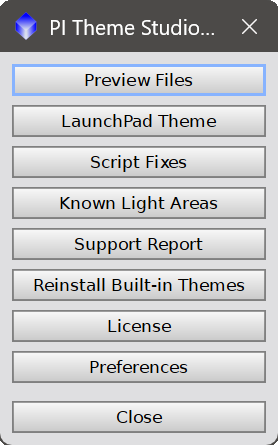
The extras: preview files, a matching PI LaunchPad theme, script fixes, the known light areas, a support report, reinstalling the built-in themes, the license, and preferences.
| Preview Files | Write what the selected theme would deploy into its preview folder, with a report and a contact sheet of every icon, then open that folder. Applies nothing. Mostly for theme authors; see Section 6.1. |
| LaunchPad Theme | Save a PI LaunchPad theme matching the selected PI ThemeStudio theme, to load in LaunchPad’s own Theme Editor. A PI LaunchPad theme for the look in force is also kept up to date on its own, as PIThemeStudio-current.pilptheme in PI LaunchPad’s folder (Section 6.5): it is rewritten whenever a theme is applied, PixInsight Default included, and on every revert and snapshot restore, which write PixInsight Default’s. Load it in LaunchPad’s Theme Editor with Load theme…. Nothing is written when PI LaunchPad is not installed. |
| Script Fixes |
Optional fixes for scripts that hard-code white backgrounds, so they stop glowing inside a dark theme. Nothing is changed by opening it. The Script Fixes window first lists every script a fix would modify — the file, what the fix does, and whether it is fixed already — with Apply Fixes and Remove Fixes below. Applying asks once more before anything is written, and afterwards Details lists every file that was changed. The scripts live inside the PixInsight installation, so applying the fixes, and removing them, asks for administrator rights (Section 6.2). The original scripts are kept in the A fixed script loses its signature, so the fixes are only applied when Allow execution of unsigned scripts is on (Edit > Global Preferences > Security); otherwise nothing is changed. Allowing unsigned scripts is your decision and entirely your responsibility. The fixed scripts themselves are safe, even though they are no longer signed. They live inside the PixInsight installation, so changing them takes administrator rights — and anyone with that access to our computer has all of it, not just its PixInsight scripts. The risk that comes with allowing unsigned scripts lies elsewhere: in running unsigned Turning that option off later stops the fixed scripts — PixInsight reports The fixes are removed from this same dialog. PixInsight Default also removes them. After a PixInsight update that replaces fixed scripts, PI ThemeStudio offers to apply the fixes again (Section 6.4). Before uninstalling PI ThemeStudio, remove the fixes (here, or with PixInsight Default): nothing else puts the original scripts back, and the fixed ones would keep needing unsigned scripts to be allowed. |
| Known Light Areas | The parts of PixInsight a theme cannot recolor, why, and what can be done about each. |
| Support Report | A report for support. It contains file paths. |
| Reinstall Built-in Themes | Write the themes that ship with the module again, including any we deleted. Each one’s folder is replaced whole, so our changes to those themes are lost; themes we made ourselves are not touched. Nothing is applied. |
| License | The trial or license state, and where to register. The same as the wrench button (see License). |
| Preferences | PI ThemeStudio’s own settings. See Section 5.2. |
5.2 Preferences
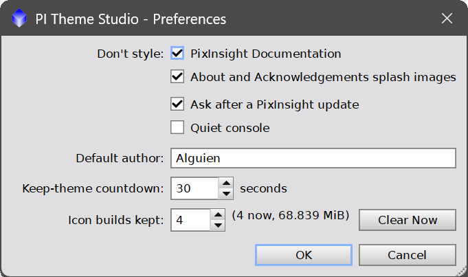
Preferences, in the Tools dialog and in the license dialog (the wrench), holds the few settings that belong to PI ThemeStudio itself rather than to a theme. They are kept with PixInsight’s own settings, and take effect when we press OK — except Clear Now, which acts at once.
| Don’t style: PixInsight Documentation | Off by default. On: no theme changes the documentation pages, whatever its own Documentation pages setting says (Section 3.6). Pages an earlier theme recolored are still put back, the next time any theme is applied: the preference means PixInsight’s own documentation, not whatever the last theme left behind. That restore asks for administrator rights once, and after it there is nothing left to put back. |
| Don’t style: About and Acknowledgements splash images | On by default: the images of PixInsight’s About and Acknowledgements dialogs stay as PixInsight ships them. Off: they follow the startup splash, tinted by a Monochrome theme whose hue is clearly a color (Section 3.4). The change shows the next time a theme is applied. |
| Check for conflicting settings when: Saving a theme | On by default. Before a theme is saved in the Theme Editor, PI ThemeStudio measures the contrast between each kind of text and what sits behind it — the theme’s colors, and its skins where it has them. A skinned panel or dialog is measured by the average color of its tile; a title bar skin by the average of its rows 12 to 24, where the title sits in PixInsight’s 36 px bar. Ordinary text has to clear 4.5:1 and bold titles 3:1, the usual figures for readable text. If anything falls short, a window lists it: what it is, the two colors, the ratio, and a suggested text color. From there we can Fix Text Colors, which writes the suggested colors into the theme as overrides and changes nothing else — not the backgrounds, not the skins — or Save Anyway, or Cancel and go back to the theme. Don’t ask again for this theme keeps that one theme out of the check for good. A theme that sets title-contrast | keep is not asked about its title bars, having said already that they stay as they are. |
| Check for conflicting settings when: Applying a theme | Off by default. The same check, before a theme is applied, with the same window minus the fix: the theme is not open for editing there, and it may well be somebody else’s. Apply Anyway goes on, Cancel stops before anything is changed. |
| Ask after a PixInsight update | On by default. After PixInsight is updated, offer to regenerate the theme for the new files, and to apply the Script Fixes again if the update replaced fixed scripts; see Section 6.4. Off: nothing is asked, and a note in the Process Console says what to do by hand. |
| Quiet console | Off by default. On: only results, warnings and errors reach the Process Console. Everything is still written to the log file (Section 6.5), which is what a support report includes. Output we ask for, such as a Details window’s Write to Process Console button, is always shown. |
| Default author | The author a new theme starts with, in New and when exporting a copy. Someone until we set it. |
| Keep-theme countdown | The time to answer Keep Theme or Revert at the next start, from 15 to 120 seconds (30 by default). It cannot be turned off: when a theme makes PixInsight unreadable, running out the clock is the way back. |
| Icon builds kept | How many icon builds are cached, from 1 to 20 (3 by default; about 14 MB each). A cached build makes applying the same theme again instant. The figure next to it shows what the cache holds now. Lowering the number trims the cache when we press OK. Clear Now removes every build at once; applied themes are not affected, as they run from their own copies. |
6 Details
[hide]
6.1 Preview Files
The icon contact sheet —
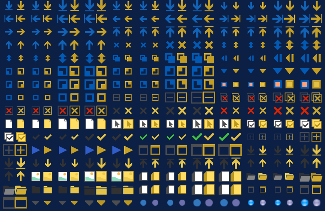
Part of the sheet Preview Files writes: every core icon, before and after the theme.
Preview Files, under Tools, writes what a theme would deploy into themes/<id>/preview: the generated style sheet, the icon override, the extras (wallpapers, documentation style sheets and the like) under extras, a report.txt, and a contact sheet showing every icon before and after. Nothing is applied. Only for themes built from a palette. The first icon build takes a while; later ones come from a cache.
6.2 Administrator Rights
Almost everything PI ThemeStudio writes goes into our own user folder and needs no special rights. Two things live inside the PixInsight installation and do need them: the documentation style sheets (docs) and the Script Fixes. A theme that neither recolors the documentation nor has to put back pages an earlier theme recolored never prompts, and neither does anything when the installation is one we can write to ourselves. When rights may be needed, the Apply question says so.
To never be asked for the documentation, turn on Don’t style: PixInsight Documentation in Preferences (Section 5.2).
When they are needed, the system asks in its usual way, and PI ThemeStudio says so in the Process Console just before:
| Windows | The standard elevation prompt. It names Windows PowerShell, not PixInsight, because PowerShell is the program doing the copying, and Windows always names the program being elevated. |
| macOS | The standard administrator password dialog. |
| Linux | The desktop’s password dialog, through pkexec. A session with no graphical authentication agent cannot show it, and the files are then left as they were. |
6.3 Applying a Theme from a Process Icon
A PI ThemeStudio process instance holds one theme: the one selected in the list. Select a theme, then drag the New Instance triangle, at the bottom left of the Manager, to the workspace: the process icon it makes applies that theme when executed globally — a convenient way to switch between a daytime look and a night-time one. Opening such an icon selects its theme in the list.
The icon applies at once, without the Apply button’s question, and reports in the Process Console. The snapshot, the restart and the keep-or-revert question work as usual. An empty id or an INVALID theme is refused, and the icon cannot be applied to an image.
6.4 After a PixInsight Update
A theme is generated from PixInsight’s own style sheet and icons, and an update replaces both. At the first start after an update, PI ThemeStudio notices, and:
If a theme other than PixInsight Default is in force, takes a snapshot of the updated PixInsight as a restore point.
Asks whether to regenerate the theme in force from the new files, so that new or changed parts of the interface follow it (also when the files changed without a new version). A theme no longer in the theme list only gets a warning, and one without a palette is offered to be applied again as it is. Yes regenerates it, which is an apply like any other: a snapshot first, and the keep-or-revert question at the next start. No asks again at the next start. Ignore stops asking until PixInsight’s files change again.
First, whatever the theme in force: if the update replaced scripts that held a Script Fix, offers to apply the fixes again. This is only offered while unsigned scripts are allowed; otherwise PixInsight’s signed scripts are left as they are, and the Process Console says so.
With Ask after a PixInsight update off in Preferences (Section 5.2), nothing is asked: the theme is left as it is, as if we had answered Ignore, and a note in the Process Console says what to do by hand — apply the theme again, or use Tools > Script Fixes. The restore point is still taken.
6.5 Where Things Live
Everything PI ThemeStudio keeps is in one folder of our own:
| Windows | %APPDATA%\Pleiades\PIThemeStudio |
| macOS | ~/Library/PixInsight/PIThemeStudio |
| Linux | ~/.PixInsight/PIThemeStudio |
Inside it:
themes | One folder per theme, holding its theme.txt, palette.txt, skins and other images. |
snapshots | One folder per snapshot, each with its own offline recovery script. |
deployed | The generated style sheet and resource files of the theme in force. |
originals | The documentation style sheets as PixInsight ships them, so that they can always be put back. |
script-fixes | The original scripts behind every Script Fix. |
cache | Recent icon builds (how many are kept is set in Preferences), and preview images. |
elevated | The script and result of the last step that needed administrator rights. |
logs | One log file per day, the newest 14 kept: everything PI ThemeStudio wrote to the Process Console, and every message it showed, with our answer. |
Also here: journal.xml (the apply in progress, for Revert and the keep-or-revert question), snapshot-policy.txt (the pruning rules), registry.txt (what a snapshot captures), builtin-themes.txt (the built-in themes already installed, so a deleted one stays deleted) and install-deployed.txt (fingerprints of the files written into the PixInsight installation).
One file goes elsewhere: PIThemeStudio-current.pilptheme, the PI LaunchPad theme of the look in force, in PI LaunchPad’s own folder — %APPDATA%\Pleiades\PILaunchPad on Windows, ~/Library/PixInsight/PILaunchPad on macOS, ~/.PixInsight/PILaunchPad on Linux — where LaunchPad’s Load theme… looks first.
The preferences themselves are kept with PixInsight’s own settings. The Backups window shows the exact path of the snapshot store at the bottom; Open Folder opens the selected snapshot’s folder.
6.6 Uninstalling
Uninstalling a module in PixInsight stops it being loaded; it removes nothing else. A theme is not inside the module — it is PixInsight’s own appearance settings, a style sheet, resource files and wallpapers — so a PI ThemeStudio uninstalled while a theme is on leaves that theme on, with nothing left to change it. The order below avoids that.
1. Put PixInsight back first. Apply PixInsight Default and restart. This is the step that matters: it restores the appearance settings, puts the original documentation pages and any other installation file back, and removes the Script Fixes. Do it while PI ThemeStudio is still installed — afterwards there is nothing that can.
2. Remove the module. In PixInsight, uninstall it as any other module, and remove the PI ThemeStudio update repository as well, or the next update check installs it again.
3. Delete what is left, if we want it gone. Nothing here is needed by PixInsight, and nothing here is deleted for us:
| Our folder | %APPDATA%\Pleiades\PIThemeStudio (Windows), ~/Library/PixInsight/PIThemeStudio (macOS), ~/.PixInsight/PIThemeStudio (Linux). This is the big one: themes, snapshots, deployed files, the icon cache and the logs. Deleting it also deletes every backup PI ThemeStudio took, which is why it comes after step 1 and not before. |
| The module | If the uninstall left the files behind: PIThemeStudio-pxm.dll and PIThemeStudio-pxm.xsgn in C:\Program Files\PixInsight\bin\ (.dylib under /Applications/PixInsight/bin/, .so under /opt/PixInsight/bin/), and this documentation in doc\tools\PIThemeStudio\ of the same installation. |
| The LaunchPad theme | PIThemeStudio-current.pilptheme, in PI LaunchPad’s folder (Section 6.5). Only there if PI LaunchPad is installed; harmless either way. |
A few settings of ours stay with PixInsight’s own: the preferences, and the colors we publish for other Deep Sky Colors modules. They are a handful of strings under PIThemeStudio, they do nothing once the module is gone, and step 1 already tells the others to stop following us. If we reinstall later, they are what remembers our preferences.
If the module is already gone and a theme is still on, there are two ways back without reinstalling: PixInsight’s own Reset of the appearance settings, or the offline recovery script in the newest snapshot folder, which needs no PI ThemeStudio and no PixInsight (Section 4.3). The snapshot store survives an uninstall — that is the point of step 3 coming last.
7 License
[hide]
7.1 Trial and Registration
PI ThemeStudio runs as a full, unrestricted 30-day trial from the first time it is opened. The wrench button, at the right of the Manager’s bottom bar, opens the license dialog; its Preferences button opens PI ThemeStudio’s preferences, as Tools > Preferences does. It shows how many days remain and, once a license is bought, is where it is entered. Tools > License opens the same dialog.
To register: click the wrench, click Click here to register, enter the e-mail address the license was issued to exactly as it appears in the license e-mail, paste the registration key, and click Register. The license takes effect at once; no restart is needed. It is valid for every PixInsight installation we own, but each computer has to be registered once, and PixInsight updates do not require registering again.
When the trial ends, opening PI ThemeStudio shows the license dialog instead of the Manager, and executing a PI ThemeStudio process icon is refused until the module is registered.
7.2 Licensed Theme Packs
PI ThemeStudio supports licensed themes: encrypted themes that only work with a license key, so that only the registered user who holds that key can use them. A licensed theme arrives as an ordinary .pitheme file and is installed with Import like any other, but it is made for one buyer: it is encrypted to the e-mail address and license key that PI ThemeStudio is registered with.
We currently have no plans to offer licensed theme packs — only free, open themes. The feature, however, makes it possible to create themes and license (sell) them. Anyone interested in it, please contact us.
For a licensed theme to work:
- PI ThemeStudio must be registered (not in trial) before a licensed theme can be imported, and registered with the same e-mail address it was bought with. If it is not, Import says which address the theme belongs to.
- Once imported, a licensed theme is applied and backed up like any other. It is used as it is, though: Edit Theme and Export are not available for it, since it is not ours to change or pass on.
- A licensed theme is made for the PI ThemeStudio version it was bought for, and may expire; Import says so when it no longer applies.
- If our license key is ever reissued, licensed themes bought earlier have to be downloaded again, since they were made for the old key.
8 Palette Files
[hide]
This section documents palette.txt, the file the Theme Editor writes, key by key, for the very few who edit a theme by hand. Almost everything here can be done from the Theme Editor (Section 3). A few keys exist only in the file: override (beyond the Image area colors), image, transparency-colors and title-contrast. The editor keeps them, but saving from it rewrites palette.txt without hand-written comments; the previous file is kept as palette.txt.bak.
None of it is needed to use PI ThemeStudio to the full, and none of it leads to better themes — if anything, the opposite. It is here for the curious, and for the very few who may want to write software that reads a .pitheme.
Developers looking for the theme values PI ThemeStudio publishes for other modules will find them in Section 8.9.
8.1 How a Theme Works
A theme is a folder holding two text files, plus whatever images it brings:
theme.txt | Name, author, category, version, description, which palette file to use (stylesheet | palette.txt), format | 1, and optional setting lines; any other key makes the theme INVALID. The Author field at the top of the Theme Editor writes it for a theme made here; for a theme that ships with PI ThemeStudio, or one imported from someone else, it is shown but fixed. An exported theme carries it. |
palette.txt | The rules. This is what the Theme Editor edits. |
PI ThemeStudio does not ship a finished style sheet. It reads PixInsight’s own core-standard.qss every time a theme is applied, and rewrites each color in it according to the palette’s rules. That is why a theme keeps working when PixInsight changes its style sheet in an update, and why a theme is a few kilobytes of text rather than a copy of the interface.
For every color, the first matching rule wins: an override (tried in the order written, so narrower ones go first), then a map for that color’s role, then an any map, then the general mode, followed by max-lightness and monochrome. A color set by an override or a map is used exactly as written. A setting line in theme.txt writes a PixInsight setting directly, and wins over the value a palette key would write for the same setting (wallpapers, shadow, transparency); it cannot set Application/StyleSheetFile, which the palette generates.
Colors may be written as #RGB, #RRGGBB, #AARRGGBB, rgb( r, g, b ), rgba( r, g, b, a ) with a in 0–255 or as a percentage, or by name.
Every color also carries a role, which is how a rule can repaint text without touching backgrounds:
fg | Text: color and selection-color. |
bg | Any background property, gradients included. |
border | border* and outline*. |
other | Anything else. |
any | All of them. |
The role comes from the property name alone: color and selection-color are fg; any property containing background (background, background-color, selection-background-color, gradient stops included) is bg; any starting with border or outline is border; the rest is other. Colors are rewritten in place, one value at a time, so the sheet’s own selectors, order and specificity never change. What a theme adds — the blocks some keys write, the QDialog, QMessageBox colors a changed palette needs, and skins, which follow every color rule — is described with each key below.
A theme’s sheet is generated when it is applied, from the core-standard.qss of the PixInsight running at the time. The Colors tab of the Theme Editor (Section 3.3) lists every color of that sheet with its role, what it paints, and the selectors behind it: the quickest way to find which rule paints what.
8.2 Mode
The general rule, applied to every color that no explicit rule claims.
| Key | What it does | Qt, and PixInsight settings |
|---|---|---|
mode | darken | Backgrounds, borders and other colors lighter than the threshold, and text darker than it, have their lightness inverted and their hue kept. Areas PixInsight already draws dark stay dark. This is how a light interface becomes a dark one without turning into a photographic negative. | Every color value in core-standard.qss, in every rule, by the role of its property (Section 8.1). Also the documentation style sheets when docs | generate, and the colors published for other modules (Section 8.9). |
mode | invert-lightness | Every color’s lightness is inverted. | As darken. |
mode | none | Colors stay as they are unless a map or override says otherwise. | Nothing, except where a map or override applies. |
darken-threshold | 0–100, default 50. The lightness that divides “light” from “dark” above. | As mode. |
invert-range | A | B | What L* white and black become, so a dark theme need not reach pure black. Default 10 | 92. The new lightness is A + (B − A)(1 − L/100): white becomes A, black becomes B. | As mode. |
chroma | 0–2, default 1. Scales the saturation of the colors the mode inverts: below 1 mutes them, above 1 intensifies them. Grays have none to scale. No effect with monochrome. | As mode. |
max-lightness | 0–100. Dims every derived color. | As mode, applied after it. |
monochrome | A color, or none. Every derived color takes this hue. With max-lightness, this is the whole of a red observatory theme. | As mode, applied after it. |
hue-shift | −180–180 degrees. Turns the hue of every color — maps and overrides included, unlike max-lightness and monochrome, and the colors other keys set by hand (frame-color, group-color, group-title-color, drop-shadow, transparency-colors, icon-background, icon style and tint colors) — keeping lightness and saturation. Grays stay gray; a kept image area stays as it is. Ignored with monochrome. | As mode, applied after every rule. |
images | swap-dark-light | none | Use the -light variants of arrow images where every scale of them exists; none keeps PixInsight’s. | url(:/qss/…-dark.…) becomes -light in: QComboBox::down-arrow, QSpinBox/QDoubleSpinBox::up-arrow and ::down-arrow, QScrollBar::up-/down-/left-/right-arrow, QHeaderView::up-arrow/::down-arrow, and the QTreeView::branch open/closed arrows. |
8.3 Colors
The complete PixInsight palette, one row per color: what it paints in plain words, the color PixInsight uses, the color the theme gives it, its role, how many rules use it, and the Qt selector behind it. The table opens sorted by what it paints; clicking a column header sorts by that column.
Double-clicking a row picks a color for it by hand, which writes a map line. Two rule forms are available:
| Key | What it does | Qt, and PixInsight settings |
|---|---|---|
map | role | core color | new color | Replace one of PixInsight’s colors wherever it appears in that role. A new color with no alpha keeps the alpha of the one it replaces. | Every rule where that color is the value of a property of that role. |
override | text in the selector | property | color | Replace a color only in the rules whose selector contains that text; the property may be *. This is the sharpest tool available: it reaches one widget without touching everything that happens to share its color. | Only the rules whose selector contains that text, and only that property (or every property, with *). The text must end where a name ends: IWContainer does not match IWContainerX. The match is case-sensitive, and overrides are tried in the order written. |
8.4 Images
Icons
| Key | What it does | Qt, and PixInsight settings |
|---|---|---|
icons | auto | all | none | Recolor the icons that would be lost against the theme’s background, every icon, or none. With a monochrome color that is not gray, or with max-lightness, auto also tints the icons it leaves, keeping their lightness. | Not the style sheet: an icon override resource file, registered as Application/ResourceFileNN, replaces images of core-icons.rcc (:/icons/…, :/qss/…) at every scale. |
icon-background | What icons are judged against. Default #2B2B2B. | As icons. |
icon-threshold | 0–1, default 0.30. The share of an icon’s pixels that must be lost before auto recolors it. | As icons. |
icon-sources | core, core+used or core+compat (the default). core+used adds only the compatibility icons that scripts actually use. | core-icons.rcc, and with core+… also core-compat-1.7.rcc. |
icon | One rule per icon or group: icon | pattern | keep | recolor | color | @theme/file. * and ? are allowed and the first matching rule wins. keep leaves an icon alone, a color tints it whole, and @theme/ replaces it with our own. An icons/ folder inside the theme also replaces icons by resource path: icons/process-interface/apply.png replaces :/process-interface/apply.png at every scale. | As icons: the resource at that path in the override. |
icon-size | toolbars | tool-windows | lists | menus | tabs | 8–64 | Roomier buttons in that area, one line per area. | icon-size and qproperty-iconSize on: tool bars QToolBar, QToolBar QToolButton (plus width/height of QToolBar QToolButton); tool windows QWidget#IWContainer QToolButton, QWidget#ICContainer QToolButton; lists QTreeView, QListView, QTableView; menus QMenu, QMenuBar (icon-size only); tabs QTabBar. PixInsight sets most icon sizes in code, which wins: only the tool bars respond visibly. |
image | from | to | Replaces one image of the sheet with another resource (not @theme/); a bare file name keeps the original folder. | The url() values of the sheet that name from. |
Icon styles
| Key | What it does | Qt, and PixInsight settings |
|---|---|---|
icon-style | none, plate, outline, duotone, bevel or strong-bevel, applied to every core icon. | As icons: drawn into the icon images themselves. |
icon-style-2 | A second style over the first; the same style in both counts once. They combine in a fixed order: duotone recolors the glyph, bevel and outline work its edges, and a plate goes behind all of it. | As icons. |
icon-style-color, icon-style-2-color | auto takes the color from the icon background, or we name one. | As icons. |
Skins
A skin is an image tiled behind a surface that PixInsight normally paints with a flat colour. Three of them have a row each in the Images tab, with a path and a browse button:
| Area | What it covers | Qt |
|---|---|---|
| Panels | Process interface panels and tool windows. | QWidget#IWContainer, QWidget#ICContainer, QWidget#RTPContainer { background-image: url(:/pits-skins/panels.<ext>); background-repeat: repeat-xy; }, the image carried in the icon override. |
| Dialogs | Modal dialogs and message boxes. | QDialog#IWContainer, QDialog#ICContainer, QDialog#RTPContainer, the same ids under QDialog, and QDialog, QMessageBox. A modal dialog carries a container id too, and an id outranks a type, hence the long list. |
| Title bars | The title bar of every window in the workspace. | QWidget#WSWTitleBar[active="true"], QWidget#WSWTitleBar[active="false"]. The workspace, skin | workspace, is QWidget#WSWorkspace. Skin rules follow every color rule; only the title-contrast rule (8.6) comes after them. |
In a palette file the key is skin | panels | dialogs | titlebars | @theme/skins/<file>, and a fourth area, workspace, exists for anyone running with use-wallpapers | no — the wallpaper covers the workspace otherwise, which is why it has no row in the editor.
The image can be a PNG, a JPEG or an SVG. An SVG tile needs an explicit width and height (with a matching viewBox): they set the size of the tile, as the pixel size of a PNG does. Every @theme/ skin file must exist, or the theme is INVALID.
The image belongs to the theme: choosing one copies it into the theme’s own skins folder, so the theme can be exported whole and works on another machine. Clearing a skin, or choosing a different image, keeps the previous one next to it with a .bak ending — one backup, overwritten by the next change.
A theme that sets a panels skin and leaves dialogs empty paints dialogs with the panels skin, since PixInsight gives both the same container identity. That is consistent rather than accidental.
8.5 Look
Fonts
| Key | What it does | Qt, and PixInsight settings |
|---|---|---|
font | The interface font family. PixInsight’s own font is the fallback when a family is missing. | Put in front of "<core_sans_font>" in every font-family list of the sheet (the * rule, QWidget#IWContainer, title bars and the rest). Monospace lists are left alone. |
font-size | 5–32. The base size in points; every other size scales with it. | Every font-size in points, scaled from the 9 pt of the sheet’s * rule, so its hierarchy is kept. |
font-weight | normal, bold or 100–900. Weights the style sheet sets explicitly stay as they are. | * { font-weight: … } at the top of the sheet, the lowest specificity: every weight the sheet sets still wins. |
Surfaces and corners
| Key | What it does | Qt, and PixInsight settings |
|---|---|---|
surface | flat, raised or glossy: gradients on buttons, tabs, headers and handles. | A qlineargradient background, built from each rule’s own themed color, on QPushButton (and :hover, :pressed), QToolButton:hover/:checked/:pressed, QComboBox:!editable (and hover/:on), QTabBar::tab (and :selected, :hover), QHeaderView::section, QProgressBar::chunk, QScrollBar::handle, QMenuBar, QSlider::sub-page. flat writes border-radius: 0 on the same controls. |
surface-strength | 0–100, default 40. How far a gradient goes. | The spread of those gradients. |
surface-scope | controls, or all to extend gradients to panels, dialogs, menus and bars. The dialogs part only when the mode, max-lightness or monochrome changes colors. | all adds a softer gradient on QMenu, QToolBar, QScrollBar, QSlider::groove:horizontal, QProgressBar, QTabWidget::pane, and on QDialog, QMessageBox. |
corner-radius | 0–12. Rounds the controls the theme draws: with a raised or glossy surface, the framed surfaces; with frames | theme, every framed control and the top of tabs. No effect with flat surfaces and PixInsight’s frames. Also the fallback for group-radius. | border-radius, with border-image: none and a 1 px border, on the framed surfaces: QPushButton and its states, QToolButton states, QScrollBar::handle, and the focus states of QPushButton and QComboBox. |
Frames
| Key | What it does | Qt, and PixInsight settings |
|---|---|---|
frames | pixinsight or theme: who draws the frames of buttons, edits and lists. PixInsight draws them with a bevelled image, the theme draws them with a line. | theme: border-image: none and a solid border on QPushButton, QToolButton, QComboBox, QLineEdit, QSpinBox, QDoubleSpinBox, QAbstractScrollArea, QGroupBox; their :hover, :focus, :default, :pressed, :checked and :on states take the accent; QTabBar::tab gets the frame with no bottom edge. |
frame-width | 1–3. | The border width in those rules. |
frame-color | auto derives it from the button color, or we name one. | The border color. The accent is the border color of QToolButton:hover. |
group-frame | pixinsight, line, groove, ridge or none: the titled frames around group boxes. | QGroupBox, and *[bugfix_JS_GroupBox="true"] for script group boxes: border style solid, groove, ridge or none. |
group-width | 1–3. Groove and ridge are drawn by Qt from a single color, so they are given at least 2. Unset, it follows frame-width with frames | theme, and is 1 otherwise. | The border width of that rule. |
group-color, group-title-color | auto or a color. | Its border color; the title color is QGroupBox::title:enabled { color }. |
group-radius | 0–12, line frames only; falls back to corner-radius. | Its border-radius. |
group-title-weight | keep, bold or normal. | Its font-weight. |
Tabs
| Key | What it does | Qt, and PixInsight settings |
|---|---|---|
tab-corners | 0–12. Rounded top corners of each tab. | QTabBar::tab { border-top-left-radius; border-top-right-radius }. |
tab-padding | 2–16. Padding inside a tab. | QTabBar::tab { padding }, twice as wide at the sides. |
tab-selected | default, bold, underline or raised. | QTabBar::tab:selected: font-weight: bold, a 2 px accent border-bottom, or for raised extra padding-top with QTabBar::tab:!selected { margin-top: 4px }. |
tab-pane | default, none or line: the frame around the page under the tabs. | QTabWidget::pane { border }: none, or 1 px of accent. |
8.6 Extras
| Key | What it does | Qt, and PixInsight settings |
|---|---|---|
wallpapers | generate | none | Recolor PixInsight’s workspace wallpapers through the theme’s rules. | Not the style sheet: PixInsight settings MainWindow/WallpaperFile01 to 10, pointing at recolored copies of its own wallpapers. |
wallpaper | 1-10 | @theme/file | Our own image in one of PixInsight’s ten wallpaper slots (.svg, .png or .jpg). The file must exist, and an SVG must declare xmlns="http://www.w3.org/2000/svg" exactly — with any other, or none, it draws nothing — or the theme is INVALID. | Setting MainWindow/WallpaperFileNN. |
use-wallpapers | yes | no | Whether PixInsight shows wallpapers at all. | Setting MainWindow/UseWallpapers. |
transparency | auto | none | The image transparency checkerboard, through the rules. | Settings TransparencyBrush/BackgroundColor, ForegroundColor and DefaultColor. |
transparency-colors | background | foreground | Both squares of the checkerboard by hand; alpha is ignored. Wins over transparency | auto. | The same settings, by hand. |
drop-shadow | auto | none | color | The shadow behind windows. auto derives it from the theme; a color sets it outright, alpha included (a color with no alpha gets 50%). | Setting MainWindow/DropShadowColor. |
drop-shadow-radius | keep | 0-64 | How far the shadow reaches, in pixels. keep leaves the machine’s own setting alone. A number gives the shadow the same size on every machine; PixInsight’s own default is 30. The built-in themes state one of their own, from 10 to 40, or keep. | Setting MainWindow/DropShadowBlurRadius. |
docs | generate | none | Recolor the documentation pages. Needs administrator rights. Preferences > Don’t style: PixInsight Documentation overrides it. | Not Qt: the CSS files of the documentation, doc/pidoc/css/*.css and doc/tools/**/*.css in the installation, recolored like the sheet. |
title-contrast | auto | keep | auto (the default): a window title too faint on its title bar, under 3:1 counting a title bar skin, is given the theme’s own text color, darker or lighter until it reads, and a warning says so in the Theme Editor, Preview Files and the Process Console. keep leaves the theme’s title colors as they are, for a deliberate choice such as Red Observatory’s dim red on red. | QWidget#WSWTitle[active="true|false"] { color }, added after the core’s own rules. |
module-panels | theme | own | Whether plain panels that no rule paints — Preferences sections, some module panels — take the theme’s background. | theme opens the sheet with QWidget { background-color } in the window color, then gives back transparency to QAbstractScrollArea > QWidget (and one level down), QLabel, and pi--WorkspaceWindow with its direct children. It also makes QWidget#WSWorkspace > QWidget transparent. Every core rule comes later or is more specific, so it only reaches widgets nothing else paints. Written only when the mode, max-lightness or monochrome changes colors. |
8.7 Image Area
| Key | What it does | Qt, and PixInsight settings |
|---|---|---|
image-area | keep | theme | Whether the image canvas, previews and the console take the theme, or stay exactly as PixInsight draws them. | keep leaves every color alone in rules naming #IVContainer, #RTPRender, #IVPreviewText, #IVPreviewFrame, #IVPreviewEditFrame, #IVSynchronizedRegionFrame, #IVSynchronizationMark, #IVSTFActiveViewSelectorFrame, #IVCursor0–3, the #FW… floating window ids, #CWConsole, #CWCommandLine, #CWSplitter, #CWTerminalColor0–7 and #WSWorkspace. An override still applies there: that is how the Image area tab’s colors work. |
Keeping the image area is the conservative choice, and a defensible one: the picture we are working on, and the background it sits against, stay as PixInsight designed them however dark or loud the rest of the interface becomes.
8.8 Sharing a Theme
Export writes the theme, its palette and its images into a single .pitheme package. Import installs one, or a theme folder chosen through its theme.txt. A package with problems is refused; a folder is copied as it is, and shows INVALID in the list if it has any. The package names the theme, its author and its category up front, and an imported theme keeps that category. A theme that names its own wallpapers, skins or icons carries them along, so what arrives on another machine is what we designed. A built-in or imported theme is exported as a copy under a name and author of our own; a licensed theme is not exported.
8.9 For Developers: Following the Theme
Why a process or script stays light. A style sheet set on a widget beats the application’s, and so does any color set in code. A theme reaches every control that is left alone; a control given its own style sheet keeps exactly what it was given. The first remedy is the simplest: leave colors to PixInsight wherever possible, and use its standard controls and object names (IWContainer, IWSectionBar and the rest), which every theme already paints.
The theme in force. PixInsight loads its style sheet once, at start-up. A theme applied during a session shows at the next start, so a process that follows the theme should read the values below once, when it starts, and keep them for the session.
| Setting | Holds |
|---|---|
Application/StyleSheetFile | The path of the style sheet in force. With a theme applied, the one PI ThemeStudio generated for it; with PixInsight’s own look, core-standard.qss. |
Application/ResourceFile01…10 | The resource files in force. A theme with icons or skins adds its own override here. |
The colors, published. Every time a theme is applied, PI ThemeStudio publishes a small set of its colors as global settings of the PIThemeStudio module, readable by any other module. They are named after what a module paints, not after PixInsight’s colors, and each is derived from the PixInsight color shown, through the theme’s rules — so a module painting its own widgets with them matches the sheet around it.
| Key | Value | Derived from |
|---|---|---|
Version | 1, the format of these keys. | — |
Active | 1 while a theme with rules is applied; 0 for PixInsight Default, after a revert, or for a theme that brings its own style sheet. With 0, or with the key missing, a module keeps its own colors. | — |
Window | Tool bars, menu bar, panel chrome. | #F0F0F0 as a background |
Panel | Panels, paper, the selected tab. | #FFFFFF as a background |
Alt | Unselected tabs, alternate surfaces. | #E0E0E0 as a background |
Control | The face of a control. | #C0C0C0 as a background |
Text | Text. | #000000 as text |
TextDim | Disabled and secondary text. | #707070 as text |
Border | Borders. | #B0B0B0 as a border |
Accent | Selection. | #5A99F0 as a background |
AccentText | Text on the selection. | #FFFFFF as text |
SelectedRow | A selected row in a list. | #C7D4E9 as a background |
RowAlt | Alternate rows. | #F0F5FF as a background |
Surface | flat, raised or glossy. | surface |
Strength | 0–100, how far a gradient goes. | surface-strength |
Radius | Corner radius in pixels. | corner-radius (3 when the theme sets none) |
Font | The interface font family; empty when the theme keeps PixInsight’s own. | font |
FontSize | The base font size in points; every other size of the interface scales from it. | font-size (9 when the theme sets none) |
Colors are #rrggbb strings. From a PCL module, each is one call, for example Settings::ReadGlobal( "/PIThemeStudio/Theme/Panel", value ) with a String value; the call returns false when PI ThemeStudio is not installed or has never applied a theme, and the module then keeps its own colors. Reading them from a script through the PJSR Settings object has not been tested.
Everything else a theme changes is in the tables above: the selectors each key writes, and the PixInsight settings it sets. A module that builds its own style sheets from the published colors, and otherwise uses PixInsight’s own controls and object names, looks right with every theme — and exactly as before when none is applied.
9 Themes Made with an AI Assistant
[hide]
An AI assistant can write a theme from a description — “a dark theme in deep ocean blues with coral accents” — if it is first given the rules. PI ThemeStudio ships those rules in one file, the AI brief, written for any assistant, not a particular one. The assistant answers with a theme folder; PI ThemeStudio imports it like any other theme, and checks it the same way.
9.1 Giving the Brief
The brief is PIThemeStudio-AI-Brief.md, next to this page in the PixInsight installation:
| Windows | C:\Program Files\PixInsight\doc\tools\PIThemeStudio\ |
| macOS | /Applications/PixInsight/doc/tools/PIThemeStudio/ |
| Linux | /opt/PixInsight/doc/tools/PIThemeStudio/ |
- Start a new conversation with the assistant.
- Attach the file, if the assistant takes attachments. If it does not, open the file in a text editor, select all of it, and paste it in.
- In the same message, describe the theme: its mood, its colors, light or dark, whether it should have wallpapers. The more concrete, the better: “warm cream panels, sepia text, a faded green accent, no wallpapers” works better than “something vintage”.
9.2 Saving the Answer
The assistant answers with a few files, each shown as a block of text with its path above it — for example glacier-night/theme.txt, glacier-night/palette.txt and, if it made wallpapers, glacier-night/wallpapers/glacier-night-1.svg. Some assistants offer the files for download instead; then simply save them.
- Create a folder with the name that starts every path (
glacier-nightabove) anywhere convenient, such as the desktop. For wallpapers or skins, create awallpapersorskinsfolder inside it, as the paths say. - For each file, copy the block’s text (most assistants put a copy button on it), paste it into a plain text editor, and save it under exactly the name shown, in the folder shown.
A few things trip people up here:
| Windows (Notepad) | In the Save dialog, set Save as type to All files, or palette.txt becomes palette.txt.txt and a wallpaper .svg.txt. Leave the encoding as UTF-8. |
| macOS (TextEdit) | Choose Format > Make Plain Text before saving; a rich text file is not a theme file. If TextEdit offers to add .txt to an .svg name, decline. |
| Linux | Any text editor saves plain text as it is. |
Save the whole text of every block, and nothing around it: not the path line above it, and not the assistant’s explanations.
9.3 Loading the Theme
- In PI ThemeStudio, click Import, below the theme list, and choose the
theme.txtinside the folder you created. The theme is copied into the theme list; the folder you saved can be deleted afterwards, or kept for later changes. - Select the theme. The preview shows it, on its own wallpaper, before anything is applied.
- If it looks right, Apply it as any theme (Section 2.2).
A folder is imported even when it has problems; the list then shows it INVALID (Section 9.4). Importing the same folder again, after a correction, asks whether to replace the theme already there: say yes.
9.4 When a Theme Says INVALID
A theme with a mistake in it — a line the rules do not allow, a wallpaper it names but did not provide, an SVG wallpaper PixInsight cannot draw — shows INVALID in the Status column, and cannot be applied. The fix is to show the assistant what is wrong, in PI ThemeStudio’s own words:
| To read the problems | Hold the mouse over INVALID: a tooltip lists them. |
| To copy them | Double-click the theme: the Details window lists every problem (it can show more than the tooltip, since it runs the full check). Apply shows the same list through its Details button; nothing is applied. In that window, Write to Process Console puts the list in the Process Console, where it can be selected and copied. |
| Or, as a file | Tools > Preview Files, with the theme selected, writes a report and opens its folder. report.txt lists the problems under PROBLEMS, and any warnings after them; it can be attached to the conversation as it is. |
Then, in the same conversation, paste the problems (or attach report.txt) and ask the assistant to correct the files. Save the corrected files over the old ones and import again.
A theme can also be valid and still have warnings — for example, window title text too faint on its title bar, which PI ThemeStudio corrects on its own. Preview Files lists those as well; passing them to the assistant gets them fixed at the source.
9.5 Refining the Look
A theme that is valid can still not be quite what was imagined. Say what to change, in plain words and in the same conversation — “the title bars are too bright”, “make the accent less saturated”, “the menus are hard to read” — and import the corrected folder again. Small changes are often quicker in the Theme Editor (Section 3), where the preview follows every edit: the imported theme opens there like any other.
Copyright © 2026 Deep Sky Colors. All Rights Reserved.