LaunchPads
Small windows of buttons that launch processes, tools, scripts, workflows, files, panels and menu commands
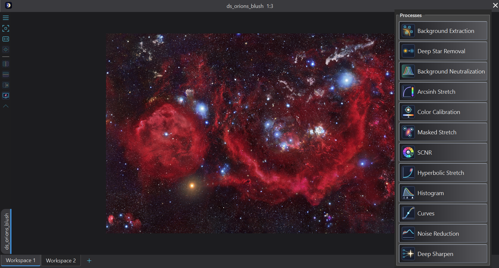
A LaunchPad is a small floating window of buttons, each of which launches something in DSPX: a process with its settings, a tool, a script, a workflow, a file, a panel or a menu command. We make as many as we like, each for a job or a project, and keep them where the work is. The Manager lists them, the editor makes them, and launchpads of PixInsight's can be imported.
1Introduction
The things we do all the time are scattered through menus: a stretch with the settings we like, the Selection tool, a script, the folder of tonight's frames. A LaunchPad puts them under one button each, in a window we place next to the image. A press that does not move is a click; pressing and dragging anywhere on the pad moves it.
A button can be set to launch:
- Process: a process, and optionally its settings as a saved process. A click opens the process's panel with those settings; Shift, or the button's Apply option, applies them to the image in front.
- Tool: a tool. A click selects it, as its button in the Tools toolbar does (a click on the active tool's button puts its panel away). A Paintbrush button can also carry a brush, and a Selection button a way of drawing and its settings (below): a click selects the tool and sets them. The button shows checked while its tool is the active one, as in the Tools toolbar.
- Script: a Python file and its arguments. A click runs it on the image in front, or without one when none is open.
- Workflow: a workflow file or a built-in guided workflow. A click runs it; Shift starts Guided Processing.
- File: a file or a folder. A click opens it as a double click would: images, sessions, projects, saved processes, workflows and scripts. A folder asks which of its files to open.
- Panel: a panel of the workspace. A click shows it and brings it to the front.
- Command: a command of the menus, such as Open or Show Mask. A click runs it. The button follows the command, as a toolbar button does: dimmed when the command does not apply now (a click then does nothing), checked when the command is on (Show Mask, Image Row), and its tooltip names the command's shortcut. A command that is a menu (Window > LaunchPads, Arrange Icons) opens that menu.
- Action: one of the actions that PixInsight's launchpads have, and some of DSPX's (below).
- Manager: opens the LaunchPad Manager.
- Control: one of the program's own controls, live: the Search field, the Image Picker, the Syrup Bottom Bar, the Syrup Top Bar, the Channel Picker, Tool Options, the Pixel Readout, the Color Swatch, Canvas Color, Colors or Recent Processes (below).
- Separator and Group: only layout. Ctrl+click on a group's title folds it.
The pad itself runs nothing as code: a script goes to the program's script runner, and a saved process is read as text.
2Quick Start
- Choose and open the Main LaunchPad, or press the LaunchPads button on the toolbar.
- Click a button to launch what it holds. Shift+click applies a process's settings to the image in front.
- To change the pad, right-click it and choose Edit.... Add a button of the kind we want, name it, choose its target and its icon, and click OK.
- To have a pad open every time DSPX starts, right-click it and choose Open at Startup.
3Interface & Parameters
3.1The Pad
A pad is a tool window of the main window, with or without a title bar. Right-clicking it offers Edit..., Manager, Show Title, Open at Startup, the docking places, Match Theme and Close, then the LaunchPads submenu: every pad, the ones shown checked; choosing one shows or hides it. Docked, the menu has the pad's options (Float, the icon size, where names show, Match Theme, Hide) and the same submenu; panels are in . Without a title bar the window is frameless and as large as its layout, and cannot be resized. Where a pad was left on the screen is remembered, and a place on a screen that is gone brings it back onto the main window.
Ctrl+drag on a button moves it: a ghost follows the pointer and a bar shows where it will land, before or after a button, or at the end of a group when the pointer is over its frame. Dropping a button into a group or out of one changes the group's membership. A plain drag still moves the window; a group's heading is moved in the editor.
Match Theme, in the pad's right-click menu floating or docked, gives the pad the current theme's look as its own: its colors (background, text, hover, checked, disabled, borders, groups), its buttons' corner radius, frame, padding and surface, the toolbar icon size, the theme's font, and its window skin as a tiled wallpaper. The layout (display mode, columns, spacing, name position) stays the pad's. It is a copy: a later theme does not change the pad. The other way, the colors that follow the theme, is Use the application theme's colors in the editor. Match Theme from the menu asks first, then is kept at once and cannot be undone there; in the editor it is a step of the draft. On a built-in pad it gives the pad a look of its own, and Reset to Default brings the program's look back.
3.2The Manager
The Manager, , lists the pads with Show, Name, Buttons, At startup and Note. Its buttons:
New: Makes a pad.
Edit: Opens the editor on the selected pad.
Rename: Renames the selected pad.
Duplicate: Copies the selected pad.
Delete: Deletes the selected pad. A built-in pad cannot be deleted: untick Show to hide it.
Reset to Default: Shown for a built-in pad: puts back the program's own buttons and look.
Look: Gives the selected pad one of the bundled looks. There are 29.
Add default pad: Adds the ready-made pad again, the light or the dark one to match the look in use (the Psycho'n pad under the Psycho'n (Dark) look), and opens it in the top-right corner of the work area.
Import PixInsight launchpads: Reads launchpad files of the module PI LaunchPad (.pilp). The
look comes as it is. Process buttons become the DSPX process of the same PixInsight id, with the settings of their stored
instance, read as text and never run. Built-in actions become the menu command that does the same: Undo, Redo, Zoom to fit,
Zoom in and out, Auto and Reset stretch, Toggle stretch, the mask commands, Save and Save As. File and folder buttons stay;
groups, separators, the Manager button, icons and notes come over. A button that ran a script in JavaScript, a process DSPX
does not have and an action with no command are left out and listed in a report. For a Spectrophotometric Color Calibration button
that carries the data of a curve, the report says which curves were taken from that data, with their names and numbers of points.
Names of images from the pad's own session (the reference image of Linear Fit, a view id) are not kept: those settings start from
their defaults, and the report says which buttons were cleared. Numbers and choices stay.
Import file: Reads a DSPX launchpad file (.dspxpad) or a look (.dspxpadtheme).
Export: Writes the selected pad to a file.
A Manager button on a pad has a small badge, which the Window tab of the editor can turn off. Clicking it pops up the list of launchpads: a row shows or hides a pad, and Show all, Hide others and Gather here arrange them.
3.3The Editor
The editor has three tabs. Its changes show on the real pad at once. OK keeps them, and Cancel shows the pad as it was. Ctrl+Z and Ctrl+Y, and the buttons by the name, undo and redo every change of the buttons, the look and the window options; typing in a field or turning a spin box is one step until it pauses.
Under the name, on every tab, are the look's buttons. Match Theme gives the pad the current theme's look as its own, as in the pad's menu. Reset puts back the look the pad had when the editor was opened; it is off while the look is the same. Load takes the look of a theme file and Save writes the look as one.
Buttons: The tab to add buttons by kind, remove, copy, move and group them, and give each its name, tool tip line, target, saved settings (of a process, from the panel or from a file) and icon. A button added for an image file gets a thumbnail of the file, kept inside the pad (XISF, FITS and TIFF through an automatic stretch). Pictures > Make thumbnails or Clear thumbnails does it for all.
Look: The tab for every adjustment of the pad's look: the layout (display mode, icon size, columns, padding, spacing, alignment), the buttons (corner radius, border, 3D, gradient, shading, icon opacity, texture), the text (font, size, bold, label position), the hover effect (none, magnify, lift, glow, press, brighten), the groups, the separators, the colors (with a checked button's fill and a disabled button's name; transparent, they are made from the other colors) and the wallpaper. The colors are the theme's by default, so a theme change changes the pad; turned off, the pad has colors of its own. Under the list of pages, the Themes panel lists the bundled looks. Picking one in the list changes the pad at once, so the pad itself is the preview, and the editor stays open. Cancel puts the old look back, and OK keeps the new one.
Brush: For a Tool button that launches the Paintbrush, the fields Brush type, Size, Softness, Opacity, Blur (Detail for Sharpen) and Ink, each with a check box. A checked field is set by the button; an unchecked one is left as the Paintbrush has it, so a button can change only the size, or only the type. Take from the Paintbrush fills every field with the brush the Paintbrush has now. With a brush type and no icon of its own, the button shows the type's icon, and a name we did not change follows the type.
Selection: For a Tool button that launches the Selection tool, the fields Draw, Feather, Contract/Expand, Tolerance, Metric and Add/Subtract, each with a check box, as for the Paintbrush. Take from the Selection tool fills every field with the values the tool has now. With a way of drawing and no icon of its own, the button shows that way's icon, and a name we did not change follows it.
Window: The tab for the title bar (on by default), Open at startup, the note and the Switcher badge. Turning the title bar on or off leaves the pad's buttons where they are on the screen.
Columns set to Auto lays the pad out as a toolbar: one row, each button as wide as its name, or one column when it is docked on the left or the right. The built-in pads have it.
3.4Paintbrush Buttons
A Paintbrush button keeps a brush: a click selects the Paintbrush and sets the values the button carries; the others stay as they are. With the Paintbrush already active, a click only switches to that brush, so a row of them is a set of ready brushes. The quickest way to make one is to set up the brush in the Paintbrush's panel and drag its brush handle (the brush icon by Protect highlights) onto a pad, floating or docked: the button gets every value, the type's icon and the type's name. Its tooltip lists what it sets, such as "Blur, size 40 px, opacity 60%". A Tool button for the Paintbrush with no brush only selects the tool, as before. Every Paintbrush button shows checked while the Paintbrush is active, whichever brush it has.
3.5Selection Buttons
A Selection button works the same way for the Selection tool: a click selects it and sets the way of drawing, Feather, Contract/Expand, Tolerance, Metric or Add/Subtract the button carries; with the Selection tool already active, a click only switches. Set up the tool in its panel and drag its preset handle (the Selection icon by Subtract) onto a pad, floating or docked: the button gets every value, the icon and name of the way of drawing ("Magic Wand"), and a tooltip such as "Magic Wand, tolerance 0.25, subtract". The values go to the steps drawn next; steps already drawn keep theirs. Every Selection button shows checked while the Selection tool is active.
3.6Actions
An Action button, added with Add > Action..., runs one of: Show or hide, Enable or disable, Invert and Remove mask; Undo and Redo; Zoom to fit, 1:1, in and out; Auto stretch, Auto stretch unlinked, Reset and Toggle stretch; Save and Save as; Next and Previous image; Close and Minimize other images; and, of DSPX's own, Open, Close, Restore minimized images, and the window arrangements Cascade, Tile and Tabs. Most run a menu command; the window actions work on the workspace shown.
3.7Controls
Add > Controls in the editor puts one of the program's own controls on a pad, floating or docked. It is not a button that opens the control; it is the control itself, and it works as it does in its toolbar:
- Search: the search field. Typing in it opens the command palette with what we typed.
- Image Picker: the open images (and the Layers toggle). The image chosen comes to the front.
- Syrup Bottom Bar: the display range, the curve, the linked channels, Negative and False color, the grid and profile tools, zoom and rotation, for the image in front. The looks apply while a Syrup Bottom Bar shows, the toolbar's or a pad's.
- Syrup Top Bar: Open, Undo, Redo and the Image Processing, Tools and Scripts menus.
Seven controls are not on any toolbar; they live only on pads:
- Channel Picker: what the image in front shows: RGB (all of it), or one channel or color component as gray: Red, Green, Blue, Luminance, CIE L*, CIE a*, CIE b*, CIE c*, CIE h*, Hue or Saturation. Only the screen changes: no pixel of the image, no history step, nothing saved with it, and the tools, processes and exports read the image as it is. Each image window keeps its own choice while it is open, whether a Syrup Bottom Bar shows or not. A component is taken from the picture on the screen (after the screen stretch and the color management) and shown as Channel Extraction normalizes it: Luminance as the gray of the same brightness; L* from black (0) to white (100); a* and b* with middle gray for neutral, lighter and darker for the two opposite colors; c* from black (neutral) up; h* and Hue as the angle, 0 to 360 degrees from black to white, with neutral pixels black. A gray image offers RGB and CIE L* only.
- Tool Options: the options of the active tool when it is the Paintbrush, Clone Stamp, Spot Healing, Selection or Text: the main ones in a row, every one of them under More. They are the tool's own values, the ones its panel shows: a change here is the tool's at once and its panel follows, and a change in the panel shows here. For Text, the style only (font, size, color, bold, italic, underline, shadow, opacity, alignment), never the text or where it is. With none of those tools active it says so.
- Pixel Readout: the pixel under the pointer, over any image: its x and y, its color as #rrggbb (the pixel's values in 8 bits, not the color the screen shows), its right ascension and declination when the image has an astrometric solution, and on a second line its values as the window's readout shows them. It is empty when the pointer is over no image. Its text can be selected and copied.
- Color Swatch: the color of the Paintbrush (its ink, which the Normal action paints with) and of Draw (the color of new shapes), whichever was set last. A click opens the color dialog; the color chosen goes to both tools, ready for the next time they are used. Their panels are not opened; a panel that is open shows the new color. A color chosen in either panel shows here. The color is a chip on a button of the pad's look (its corner radius, border, 3D and gradient, its button colors), as tall as the pad's buttons at its icon size; the color fields of Tool Options look the same.
- Canvas Color: the canvas color DSPX shares with Canvas Size, Crop, Rotate and Layers' canvas dialog (see Crop: Canvas color), as a swatch like the Color Swatch. A click opens the color dialog; the color chosen is the shared color at once, its alpha kept. Images that have a canvas color keep theirs.
- Colors: the foreground color (the Color Swatch's) and the canvas color together, as a paint program shows them: the foreground's chip in front, at the top left, and the canvas color's behind it, at the bottom right. A click on either chooses it. The small arrow at the top right swaps them, and the small pair at the bottom left sets the defaults, a white foreground and a black canvas. Each part's tooltip says what a click does. It takes the Color Swatch's size and place.
- Recent Processes: the list of Process > Recent Processes. The process chosen opens its panel.
A control takes the room it needs: in a row of buttons it makes that row wider or taller. It follows the image in front as its toolbar does, and two pads with the same control show the same. Nothing inside a control is edited: it is added, moved and removed like a button, and its name and tooltip line can be changed. Its icons take the pad's icon size (16 to 32 pixels) and the Syrup Top Bar the pad's display mode; with colors of its own, the pad's font and text color go to the control's labels. A pad with a wide control may be too wide to dock on a side. Docked and short of room, a pad laid out as a toolbar folds the controls past the end into its overflow menu (»): Search becomes an entry that opens the palette, the Image Picker a list of the images, the Syrup Top Bar its commands and menus, the Channel Picker a list of the channels, the Color Swatch and Canvas Color an entry that opens the color dialog, Colors four entries (Foreground Color, Canvas Color, Swap Colors, Default Colors), Recent Processes the list of processes; the Syrup Bottom Bar, Tool Options and the Pixel Readout are left out. The toolbars Search, Syrup Top Bar, Syrup Bottom Bar and Image Picker stay as they are.
3.8Built-in Pads
The program's toolbars of buttons, Tools, File, Window, Settings, Masks and Layers, are LaunchPads too: built-in pads, docked as toolbars by default (see The Workspace). The Manager lists them with the note Built-in, lists them, and the editor changes them as any pad. A changed one is kept as a file of its own; Reset to Default, in the editor, the Manager and the pad's right-click menu, puts the program's own back and removes that file. A built-in pad is never deleted, only hidden. Its At startup is the Layout page's Show at start, and until it has a look of its own, the page's Buttons and Name say how it shows its buttons. When a later version adds a button to a built-in pad, a pad we changed gets it at its end, unless we had removed it. Close All LaunchPads leaves the built-in pads alone.
4Opening Pads
The pads marked Open at startup open when the main window is shown. Nothing else opens by itself, apart from the pads of a saved layout and of the last session.
The first time DSPX starts after an installation, a ready-made pad of common processes is made and opened in the top-right corner of the work area, dark or light to match the look we start with; the Psycho'n (Dark) look has a pad of its own, named Psycho'n: four groups (Prepare, Stretch, Refine and Tools) of icons in the look's teal on its dark ground. It is made only that once, and only when there are no pads yet: an update never adds it, and a pad we delete does not come back. We can move, close, edit or delete it like any other pad. To get it back, press Add default pad in the Manager.
A saved layout, , records which launchpads are shown and where. When we load a layout of ours that shows launchpads (or a styled toolbar, the Syrup Top or Bottom Bar), those show where they were and every other launchpad is hidden: hidden, not deleted, it opens again from the LaunchPads menu. A launchpad that was hidden when the layout was saved, or that was deleted since, does not count, and DSPX's own toolbars never count: they follow the layout as its panels do. A layout of ours that shows no launchpad leaves them as they are. Of the built-in layouts, PhotonChop shows its two launchpads and hides the others, Syrup shows its bars and Psycho'n its own look with none of our launchpads; the others leave them alone. A theme that brings its layout does the same as that layout. The last session's arrangement is kept with the session and put back when the session is restored, as it was.
5Files
A pad is one text file, with the extension .dspxpad, in the program's data. A look alone is a
.dspxpadtheme. The Main LaunchPad, with the Manager button and a group of common processes, is made the first time and is
not opened by itself.
6Usage Tips and Tricks
A pad for a project. Put the project's folder, its saved processes and its script in one pad, and open it at startup.
Processes with their settings. Save a process with the settings we use for a kind of image, and put it on a button: one click opens the panel as we like it, and Shift+click applies it.
Brushes at hand. A small pad of Paintbrush buttons, a soft Dodge/Burn, a large Blur at low opacity and a small Sharpen, switches brushes in one click while we paint.
Selections at hand. A Magic Wand at a low tolerance, a feathered Ellipse and a Rectangle that subtracts, side by side, change the way of selecting in one click.
Keep the pad small. A pad without a title bar is as large as its buttons. Turn the title off with Show Title and place the pad beside the image.
Coming from PixInsight. Import the launchpads of PixInsight's PI LaunchPad and read the report: what it could not bring is listed.
7Related Tools
The Process Shelf keeps saved processes in a row; a LaunchPad keeps them with everything else we launch.