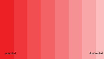
Color and Saturation
April 2010
In the photography world we often see people making comments about someone else’s image having the colors too saturated, or too weak, or too strong, vivid, etc.
Truth is, in general terms, there’s not much secret in getting the right amount of saturation we want. Here, right means what is right for us.
Depending on what tool you use, doing a saturation adjustment is accomplished by either moving a slider left and right, or drawing a curve…Seriously, how could anyone get that wrong?

Because of that, to me, any feedback about color saturation is just you expressing how much you like/dislike a particular level of color saturation, NOT how good or bad the level of color saturation actually is. It’s not contributing anything to the author’s goal, but a statement about what your own goal would have been.
Now… I said before that making color saturation adjustments is easy, but this too requires some know-how. Acquiring the right saturation level we’re looking for sometimes it’s not just about sliding away the saturation slider, and sometimes reaching that level of saturation may need some techniques so that noise is not also magnified for example, but assuming the person behind the image adjusted the saturation right where she or he wanted, my feedback about how I feel about the saturation level is an opinion based on taste – so saying “I like less saturated colors” is okay, but if you go “the color is too saturated” you might be a bit out of line. Please note that I don’t mind to hear what other people think, but other photogs may not be as gracious.
There are a few cases however where feedback about saturation can be useful….
One of such cases is when the operator simply isn’t sure if he or she gave the image the right amount of saturation. In that case, my feedback would be “well, what does it look right to you?”. Still, there may be a few factors where the author benefits from feedback about color saturation: maybe this person is trying to assess whether their interpretation matches other people’s opinions, or maybe the person was using a monitor that isn’t well calibrated, or still have little experience and are still learning, or they simply care more about what other people think (it does happen, unfortunately) and a few who simply have no idea what they’re doing.
Another case would be when we know the goals the author was trying to achieve with the particular saturation intensity she or he used, and they’re asking us if we feel such goals have been achieved.
Other than that, unless I have a strong feeling that such interpretation missed some valuable opportunity to depict something that would have contributed to the image being more consistent with that person’s view, I will simply judge quietly whether I personally like his or her style/interpretation more or less, but take such interpretation at face value: this is how the author wanted to represent this image. Next time maybe I ask him if there’s a reason for it, which is quite different from telling them that they went “a bit too far” or stepped “a tad too short” 🙂
