
Multi-scale Processing – Revealing very faint stuff
Intro
The purpose of this tutorial is to show how, using multi-scale techniques,we can bring in our image very very faint details that usually would go unseen,even in cases where we have successfully extracted very faint stuff already, of course without degrading anything else in our image.
The tutorial uses an already processed version of my image Integrated Flux World.
If you would like to see the screen-shots at a bigger resolution, simply click on the corresponding “tiny” screen-shot. A few screens-hots are actually shown in the page at the maximum resolution in which they were captured, though.
The Data
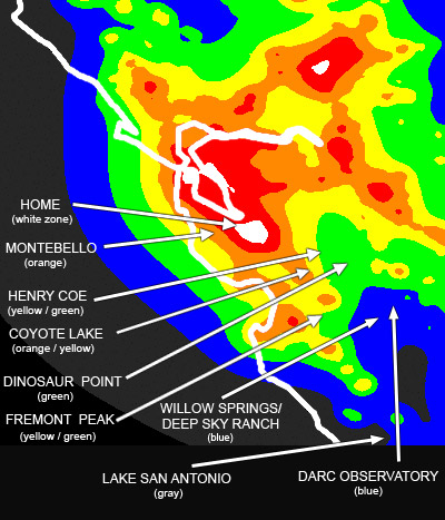
The captured data was of good quality, but not a lot of it. The master files were generated from 6 subexposures of 15 minutes each,and 3×3 minutes for each RGB channel, with a SBIG STL11k camera and a Takahashi FSQ106EDX telescope with the 0.7x reducer. The data was captured at Lake San Antonio, California over four nights – LSA is a dark site that sits right at a “gray” border in the Bortle scale, surrounded by blue and some green/yellow areas. For a light pollution map of Lake San Antonio, click here and look for its location on the bottom-right corner of the image.
The Goal
The goal in this session is trying to reveal very very faint data in regions of our image we suspect might contain such extremely faint data, as long as we decide that revealing such data makes sense from both an artistic and a documentary perspective.
1 - Preliminary work
The work detailed in this tutorial was performed over an image almost completely processed:

By observing the above image, we noticed that the area above the two arches (top-right) doesn’t present any significant IFN structures. We wonder if there’s any… For that we could simply stretch very aggressively the image, but because the image has gone through significant processing,we would get a more solid idea of whether there are IFN structures in that area by executing the aggressive stretch over an image in its early stages of processing, preferably in linear form. So we do just that and this is what we get:

Please ignore the still-uncorrected seams and other “defects”, as this is done from an image almost in its very original form.
We can immediately see that in particular, there’s a visible structure coming out off near where the two arches join – displaying a “3” shaped cloud. We therefore do have very faint structures in our image that are not appearing in our processed image.
Now, there is a risk in trying to process an image for very faint stuff after the image has been through a complete or almost complete processing cycle. The data in our processed image may not be nearly as reliable. As far as work-flow goes, this is NOT the best moment to do this. We should have noticed much earlier in the process and attack this area back then, not now. So this is an after-thought and it involves risks we would need to keep in mind. As long as we are aware of it and we perform the needed verification in the end, my opinion is that we can proceed.
2 - Breaking the image into large and small scale structures
First, let’s remember what we’re looking at:
That’s a pretty nice image. We have noticed however, that the area above the two arches in the top-right area is rather dark, and we have verified that there are IFN structures there. Our goal then is to see if we can extract that information without perturbing the already processed data, and if we can do so in a reliable manner. The data is still in 32 float bit depth,which, despite our monitors can’t display such large dynamic range, it should help us in our little quest.
We are going to follow a multi-scale approach, so our first step is to break the image into two (maybe three if we feel it’s necessary) different scale structures: large scale structures, and small scale structures.
For that we use the ATrousWaveletTransform tool (ATWT) in PixInsight. We start by generating the image with the large-scale structures. This is accomplished by only selecting the residual layer (“R”) in the ATWT tool, over a 4-6 layers dyadic sequence.

The above image may just look like a blurred version of the original. Well, in fact it is a “blurred” version of the original! The difference is that unlike a simple Gaussian blur,this image has been generated by decomposing it into a series of scale layers, each of which contains only structures within a given range of characteristic dimensional scales, and we have selected to retain in this image only the very large structures. A Gaussian blur attenuates high-frequency signal, so it is a low-pass filter. A wavelets operation using a Gaussian function is a series of low-pass filters, and the way we’re using it, it will generate similar results but conceptually we can better decompose the image into different scales.
Let’s build now the small-scale structures image. This is easily accomplished with PixInsight’s PixelMath. All we do is subtract the image with large-scale structures from the original image, so what we have left from this operation is an image defining only the structures that were removed from the large-scale image, in other words, the small-scale structures. See below a screen-shot after this PixelMath operation has been performed, and notice how the image at the bottom only contains the small details from the original image. If this image looks similar to what you usually get when you apply a high-pass filter, you’re of course right.

Now.. The image defining large-scale structures looks ok, but it is still defining some structures that we probably don’t want to see there. For instance, there’s clearly some glow from the brighter stars, and we want to minimize that. We want to see if we can reveal the faint dust, not star glow.
So we’ll repeat the ATWT process once again, this time taking as the source our image with large scale structures, and create a new image with even larger scale structures.
See below the screen-shot displaying our three images:

From now on I’ll refer to each image as follows: SS for the image defining the Small Scale structures (bottom-left in the screen-shot above), LS for the image defining Large Scale structures,and MS to the image defining even larger scale structures (Mega-large structures? 🙂
3 - Processing large scale structures
Now that we’ve broken our image into three images, each of them defining different scale structures,we start doing some processing in them. We start by stretching the histogram to the ML image. Not too much, but enough to see if there is “stuff” in our targeted area.
And yes, the area that once was mainly dark, now reveals some structures – still faint, but now visible.

This is actually the epicenter of this processing session – whatever we do here is what will contribute to the enhancements we want to add to our image. We can stop right here after this stretch,or we could try many other things… We could increase the color saturation so the structures we’re”revealing” also come with an increment in color visibility… We could apply some wavelets to enhance the structures we’re bringing from the “darkness”, we could use curves and/or PixelMath to intensify the contrast in these structures, we could even experiment with HDRWT…
And these improvements aren’t limited to the MS image only. We could also add some sharpening to the SS image for example, or also experiment with any of the processes mentioned in the last paragraph. Likewise for the LS image.
This is not to say we should go crazy. We must keep our eyes on our goals and on what the data is”telling” us. My point is only that we have a plethora of tools we can use that may (or may not) help us achieve that goal, and that’s part of the fun I find in image processing – that we can experiment with these tools to see which ones help us reach the goals we aim to achieve.
In this example I decided to just stay with this somewhat subtle histogram stretch, since that’s all I want at this point.
Of course, after our stretch to the ML image, everything else is also stretched, and we don’t want to bring all this back to our image (we could but it’s not what we have decided we wanted to do during this session), so the next step is to create a luminance-based mask that will protect everything but the darkest areas in our image.
4 - Creating the luminance-based mask
To create our mask we start by extracting the luminance from the original image.

With that done, we do a slightly aggressive histogram stretch, then use the ATWT tool to reduce the image to large structures. We don’t want the mask to be based on very very large structures, so in this case, excluding only the first five layers using a dyadic sequence works well. The reason we don’t want to go further to say, 6, 7 or 8 layers is because, as we will see in a minute, it’s not a bad idea to include in the mask some bright “spotting” caused by large stars. If we extracted only the very large scale structures, such “spots” would be gone, since they would fall under a”smaller scale” category. Also, our mask may not be protecting well our data.
Here’s our mask after the histogram stretch and isolating large (but not very large) scale structures:

Now we need to adjust our mask to protect everything but the darkest areas.Luckily, this is easy to define with the binarization tool. Well, actually it’s really not about luck. Since we’re targeting only the areas with the darkest background, a threshold point can be found that isolates these areas from the rest.
In this case, such “darkest area” is clearly the one above the two IFN arches,but if we had other areas similarly dark in the image, it’s ok. If that happens, we can decide whether to manually mask those other areas or leave them.If we leave them, all that would happen then is that we would be “bringing up to par”the fainter signal in those areas as well, which may be a very good thing depending on the case. If we choose to mask them out manually, that’s also ok as long as we have a good reason, both from an artistic and a documentary point of view (more on that in a second).
After visually adjusting the threshold with the Binarization tool on our to-be mask, this is what we get:

Indeed, we have been left with the darkest regions in the image. Two things call our attention:
- We haven’t found a threshold point where only the area we’re targeting is excluded.So we need to make a decision of whether we’ll leave the mask as it is,meaning our stretch will affect those areas as well, or whether we choose to manually protect those areas (making them white, basically). By looking at the original image and at a heavily stretched view of our almost-unprocessed image we can see that those other “black islands” happen over areas that don’t have any significant additional IFN data, so if we apply the additional stretch, it will not contribute to enhance very faint details,and instead, rather than “extracting” additional very faint data, we would remove from the image the fact that the IFN is less dense in those areas in contrast with their surroundings. This brings up a difficult question that I’ll address in a second.
- There are some bright circles in our targeted area. That’s ok and in fact not a bad thing as we shall see in a moment.
So what should we do with these “dark islands”? We have three options:
- Do nothing, and abandon this session. If we do this, our image will not document the fact that above the arches there are differences in IFN density.
- Leave the mask as it is. This will reveal the IFN above the arches, but our final image will remove or attenuate at least the also very important detail that in the “black island” areas there is an important change in IFN density.
- Manually make sure the “black islands” also get mask protection.This will reveal the IFN above the arches, and preserve the fact that the areas now targeted by the “black islands” have a lower IFN density.
Based on the above three options, I determined that the third option is the one that better reflects “where there is IFN and where there isn’t”.I conclude then that manually masking those areas is the best decision in order to meet our goals, and that the documentary value of the image is greater by choosing that option.
Although we have decided to manually mask all dark areas other than the area above the arches, before doing that, though, in order to smooth transitions when we use our mask, we’ll apply an ACDNR (noise reduction) without any type of protection adjustments or luminance mask. The reason we do this fist is to see how an ACDNR could contribute to making these “stray” dark areas perhaps more appropriate for the case at hand without having to manually adjust the mask. After applying the ACDNR, this is what we get.

Before going any further, we notice three things:
- First, we see that the ACDNR didn’t do much as far as fainting the “secondary black islands”.We therefore will be using the clone stamp (there’s no Paintbrush in PixInsight) to manually make these areas white.Using the clone stamp (or a paintbrush) to “mess up with masks” is quite acceptable to some people but almost sacrilegious for others. For this second group,the message is: We are about to apply a histogram stretch with a mask. This means we have already made the decision that we want to brighten some areas in our image while not doing so in others (not only that, we’re stretching only very large scale structures, so we’re even more selective).And although some may think that the moment we use the clone stamp (or the paintbrush) to alter a mask we are introducing a very arbitrary processing to our image, I have tried to explain the thinking process that led to this decision. It is a 100% reproducible and non-arbitrary process that rather than ignoring what the data tells us, it contributes to a better representation of the real differences in IFN density.We will then proceed to “whiten” these black “spots” with the clone stamp tool.
- Second, the tiniest stars that were still”seen” in the large dark area of our mask are pretty much gone after applying the noise reduction. That is good.
- And last, we notice that there’s still a blur for the areas where the brighter stars were (mainly 2-3 in this case). That is not only ok,is actually good. This is because one could expect that when we stretched our”MS” image, there might still be some residual flux from these stars in that image. By having a mask that gradually “protects” this area, we avoid to”reveal faint stuff” that is in fact, nothing but “glow” from a bright star.
With all this done, it is time to apply this mask to our original image.Areas in red are the areas that are being protected. Notice the “black islands”are gone but not so the bright spots over the few bright stars that are not protected.

All is left for us to do is to add back all of our previously broken down images:
- Our image with the small scale structures.
- Our image with the large but not so large scale structures.
- Our image with the very large scale structures.
We of course use PixelMath for that. The operation is a simple addition:SS+LS+MS. We must make sure the “Rescale result” option is active, so the result of this operation will produce an image within the allowed dynamic range.And because we’re using a mask, any processing we’ve done in the separate images will only affect the areas unprotected by the mask.
As an alternative, we could use different formulas that I’ll mention in a minute.
And this is a closeup of our final image over the area we’ve targeted:

The difference from our original image is not dramatic. Yes, this is faint stuff and we want it to stay that way. We could have pushed the contrast in these areas of very faint dust to get a better view of the structures. The reason we didn’t is because we didn’t t want to make these structures as visible as the rest – that would indicate that the density of IFN in these areas is similar to that in other areas. This may be in fact a perfectly valid goal in some cases, enriching the documentary value of the image, but since for the entire image we’ve tried to keep a good “IFN density balance”, we’ve decided not to break such balance this time.
Now, instead of the SS+LS+MS formula, we could have used other formulas that would tend to maximize or minimize the effect, using our own criteria. For example, instead we could have used:
- Original+SS+LS+ML. This will minimize the processing done on this faint stuff by including the original image – remember, we’re rescaling the result of this addition, so including the original image in the equation will produce a result more similar to the original image.
- SS+LS+(MS*x) where x is a number that, if less than one, will also minimize the stretch done on that image, and if larger than one, it will emphasize it even more.
- Same as above but using different ratios for each – or some – of the sub-images.
And other variations. Again, although a simple addition will probably give us a result in accordance to what we want, experimentation can be fun…
You may be wondering… If we only modified the MS image, why did we need to extract the intermediate LS image? Couldn’t we just extract the SS and MS images so that they both add up nicely when they’re put back together?
The answer is yes, we could have done that. The purpose of creating an intermediary large scale image is actually twofold:
- First, it gives us a chance to experiment modifications in either or both of the LS and MS images. In this tutorial we finally didn’t modify the LS image, but that’s because we’ve skipped some of the”experimental” procedures that I did when processing the image. It was after experimentation using different methods that I decided to make modifications only on the MS image and not the LS image.
- Second, even if we ended up not modifying the LS image, when we add everything back together, due to the fact we’ve considerably altered the luminosity of the MS image, if we were to add only the MS and SS images (assuming our LS image was the result of subtracting the original image from MS, which is not), the result would likely NOT be well balanced. By including an intermediate image, we help rebalancing the luminosity of the image. This is a similar effect to adding our scaled images along with the original.
5 - Data or artifacts?
There’s a few things we can do to see whether this “dust” we now see is real or not. As a first step we’re going to compare the image we started with against tour final image. To do that, we invert each of them, and then do an aggressive histogram adjustment to each image, separately, until both of them have similar intensity strength (meaning we’d have to go a bit further stretching the original image), then compare them:

We can see they look extremely similar, which means we haven’t added anything to the final image that wasn’t there before. We’ve simply made it a bit more visible, without inducing perceptible noise nor degrading the already bright structures in that area (in this case just stars) or anywhere else on the image.
However, this compares our original already-processed image with our result. We have not verified that the structures we’ve enhanced compare well with our data as it was when the image was still linear. To verify that, we will do the same but comparing the original linear image with the other two: the image we used before starting this session and our final image at the end of it:

As we can see, despite mainly qualitative details and some uncorrected seams and defects in the original linear image, the areas above the arches where the IFN intensity is higher seem to match nicely across all three images, in particular the 3-shaped cloud in the middle. Therefore the conclusion I reach is that this processing session yielded acceptable results and did not fabricate any non-existing signal.
6 - Wrap up
This tutorial shows one very simple way to use multi-scale processing. Someone could think that “all this” could have been reduced to create a duplicate layer, blur it, create a third layer with the difference,stretch the blurred layer it and “blend” it (add it) with the original and third layer while using a mask. If we want to simplify the description of the process, you could in fact say that, but the main difference is not only that eyeballing a Gaussian blur we could much easier induce unwanted and ambiguous “signal”, but especially that by using wavelets we’ve operated under a much more controlled environment.
Having said that, the thing is that “all this” isn’t complicated at all (I maybe made it look complicated by writing not only about what we do, but also why we do it, what other options we have, and a thinking process), but the fact is that “all this” can be wrapped up into four very simple steps:
- Break the image into small, and large scale structures
- Lightly stretch the image with the large scale structures
- Create a mask so the process only happens on the darkest areas of the image
- Add everything back together
For someone with some experience working with PixInsight, this session could be carried out in just 10 to 15 minutes.
The possibilities however go well beyond this, and depending on our goals, we could use this technique to do many very different tasks. For example, we could use wavelets over either the large or small scale images, to enhance the details at those scales. Or we could apply noise reduction over some – or all – of these images to attack noise at different scales (the ACDNR tool however is flexible enough to allow us doing that without us having to break down the image), adjust for saturation at different scales, and a very long etc.
CREDITS: The idea to break an astroimage into different scales was extensively documented by Jean-Luc Starck before the turn of the century. It was later adopted by PixInsight developers, who created the tools we’ve been discussing in this tutorial. I personally heard about the idea to break the image in different scales, process them separately, and recombine them in a tutorial written by Spanish astrophotographer Jordi Gallego. Vicent Peris from the PTeam is credited with being the original author of this technique.